When you’re an online retailer and you have a store-wide sale, the best way to announce it is often simply to say so – no example product pictures; just bold, emphatic type matched with a colorful background to make your message stand out. Oh, and a big discount.
Here is a collection of 40 sale notification emails that use typography and color to really catch your eye when they pop up in your inbox.
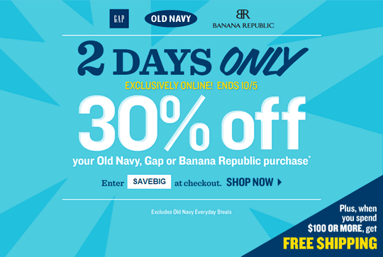
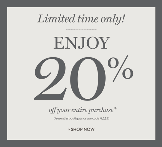
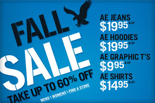
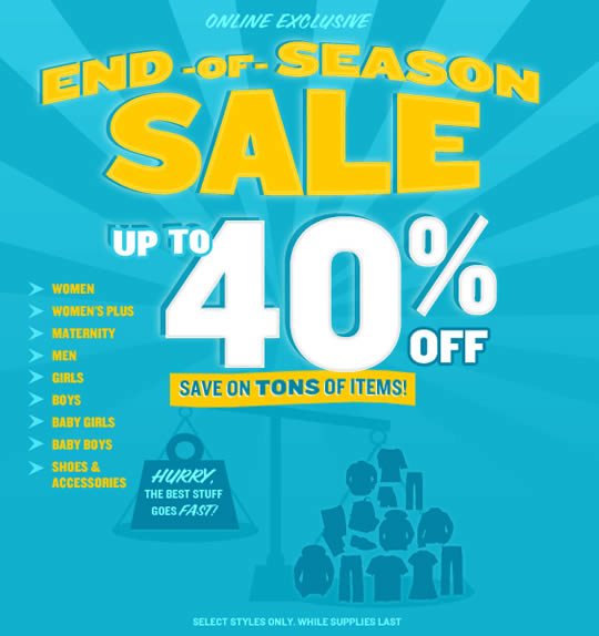
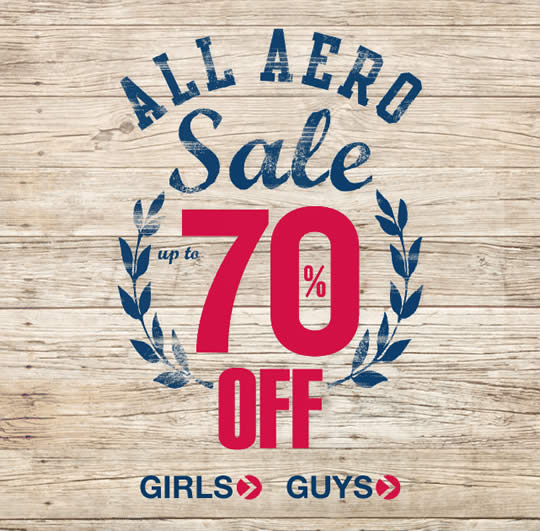
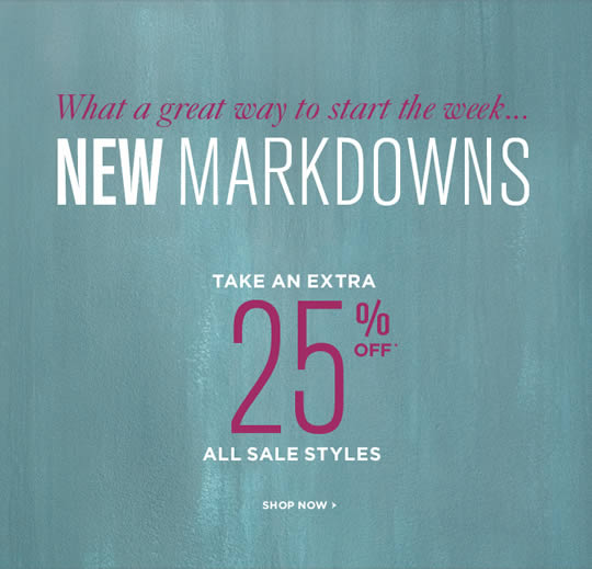
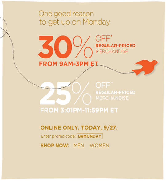
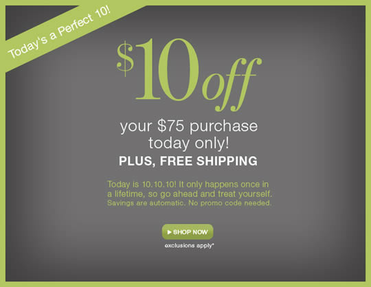
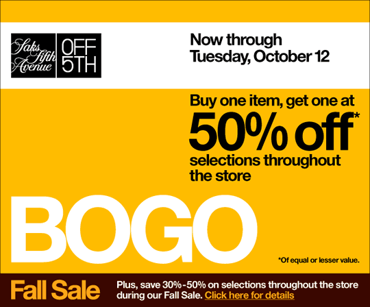
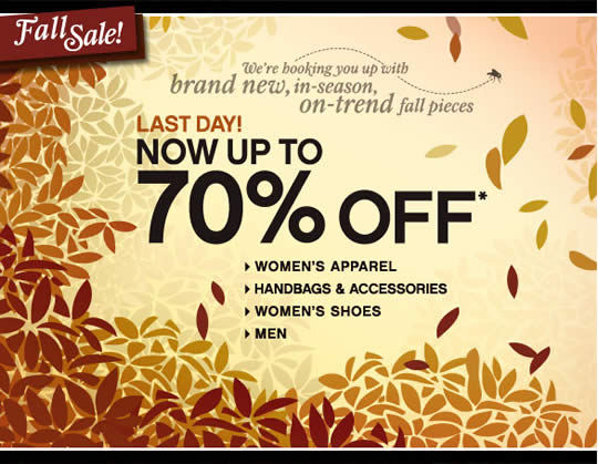
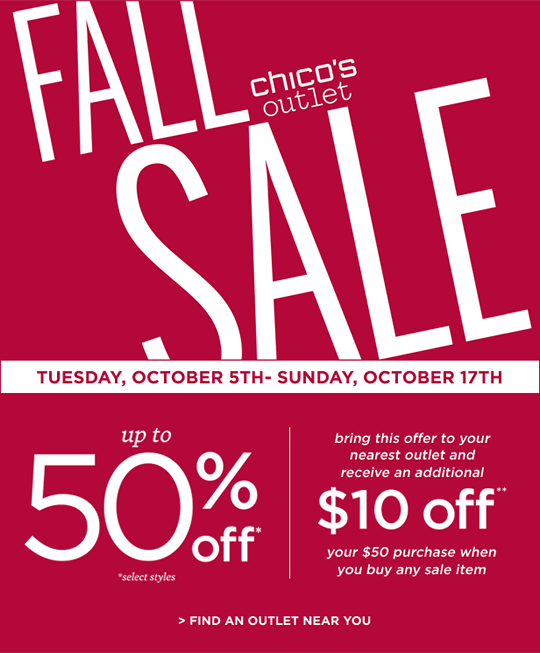
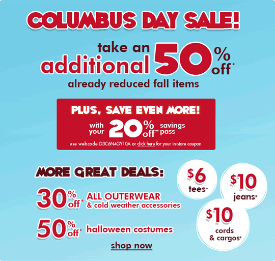
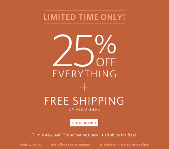
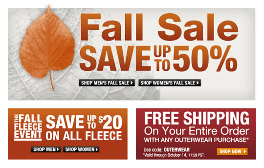
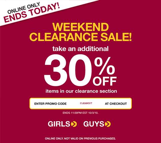
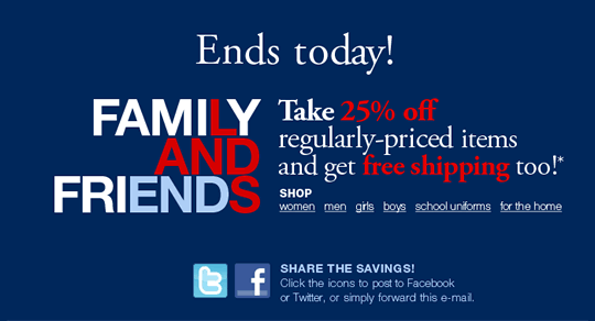

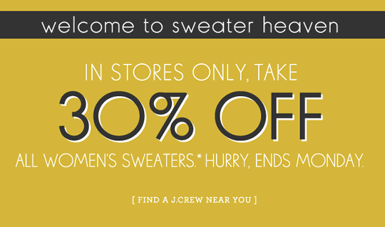
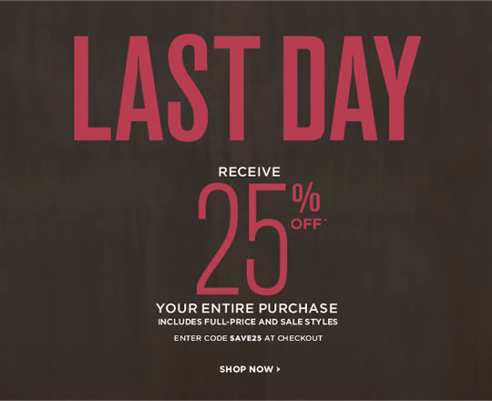
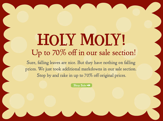
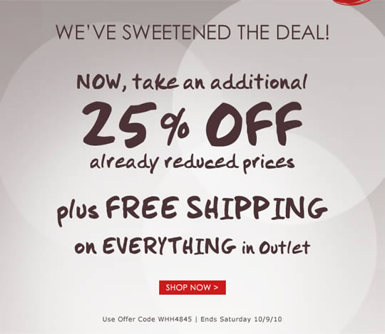
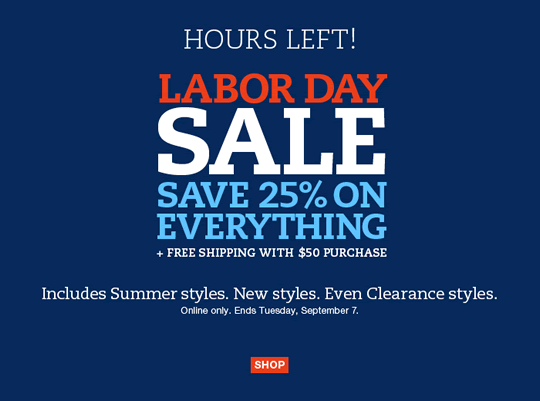
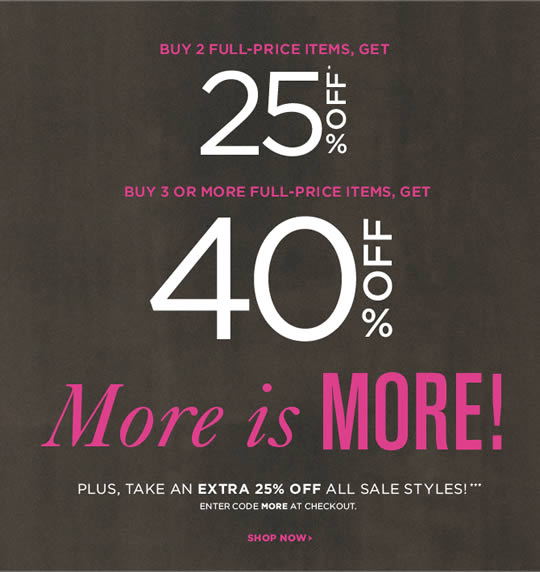
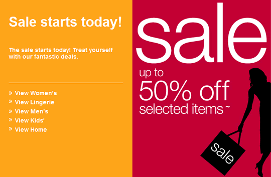
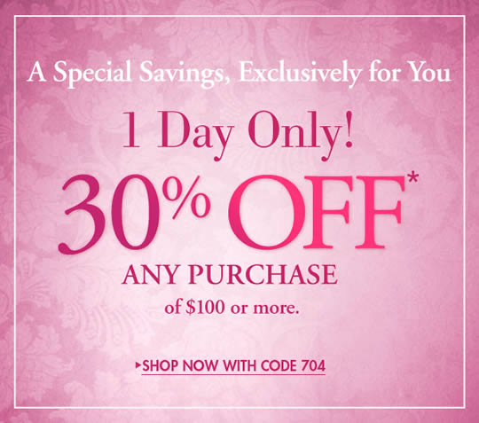
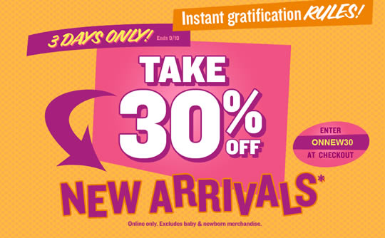
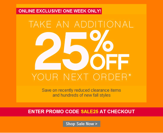
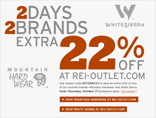
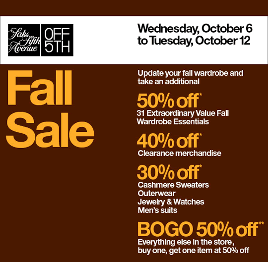
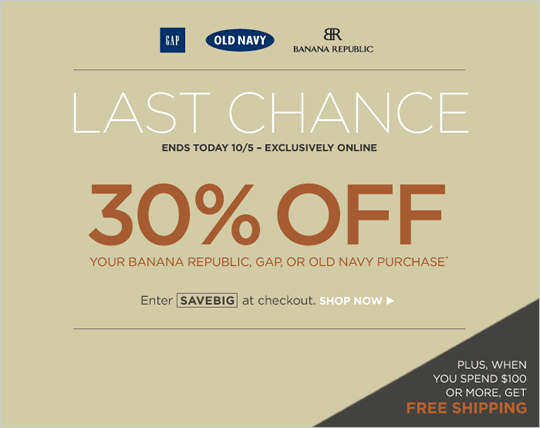

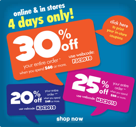
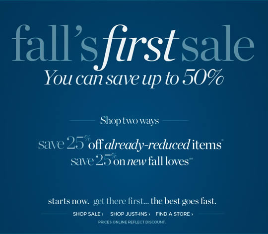
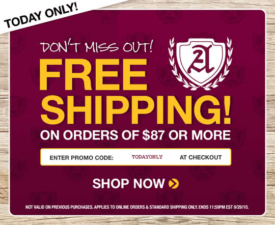
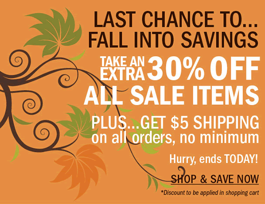

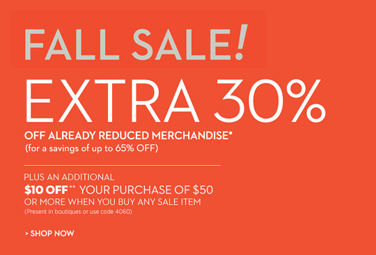
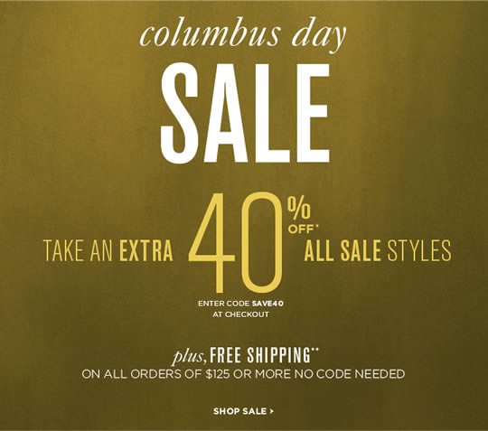
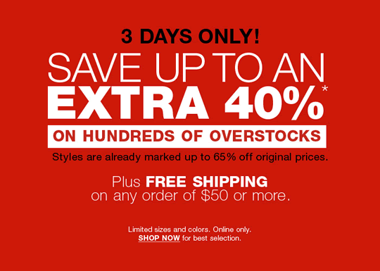
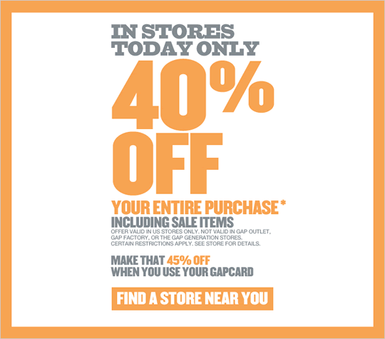
These are great examples of how to get your advertisement noticed! The bold text emphasises the offer and gives the user the information they want straight away.
The use of bright colours also grabs the users attention and makes the advertisement so much more appealing. The clever technique of making the “up to” smaller than the percentage of discount also keeps the user interested to find out how many products have this great offer.
Overall a great collection!
Great post, I think blog owners should larn a lot from this site its rattling user friendly .
I’d be interested to find out the headlines used and the click through rate on these.
Your post help me a lot. I just need information like this for Christmas and new year promotion. Thanks a lot.
Really amazing & too creative email design.
Grate dude, the quality of the design is really awesome..
i been using wording only in newsletter and lead to high bouce rate. Maybe because of bold wording are not that effective as using image to get call to action. Bold Wording Email is simple and easy to bring message but unable to target all customers unless they are looking on it.