Filling out web forms has become a part of our daily online lives. However, most people hate completing online forms because they are prone to mistakes which prevent them from completing their task. That’s why error message design is a critical component of good online form usability.
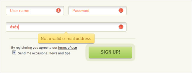
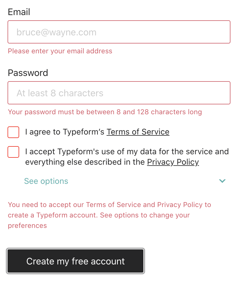
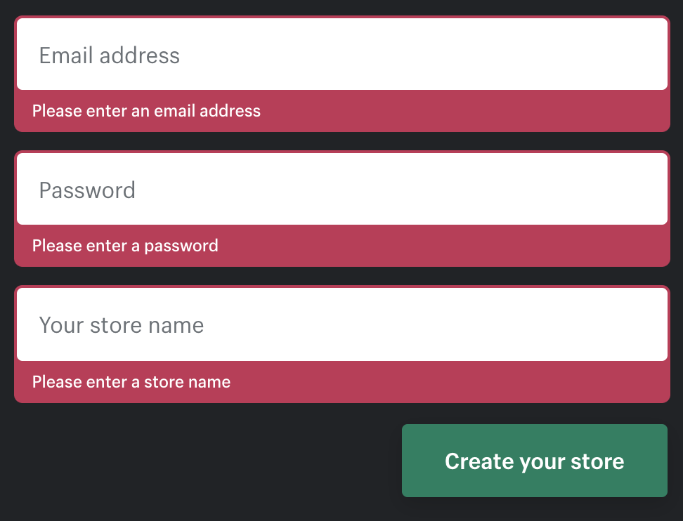
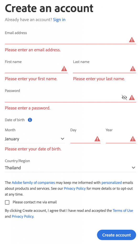
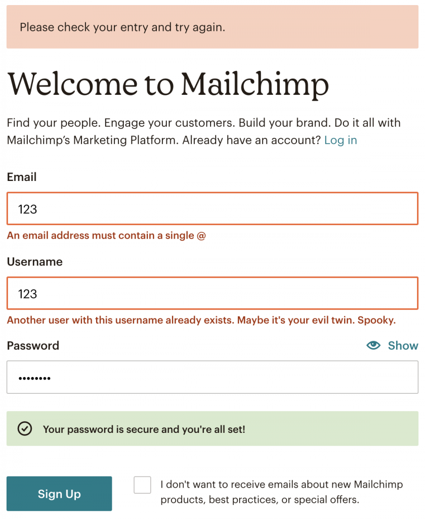
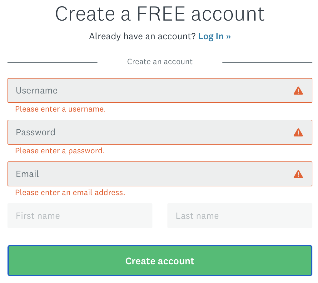
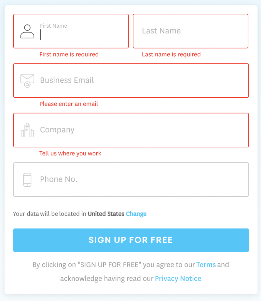
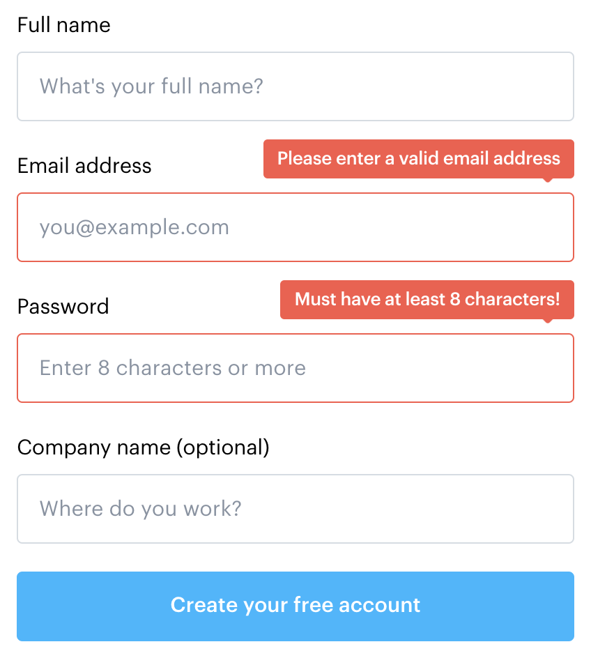
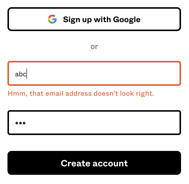
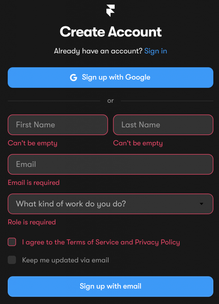
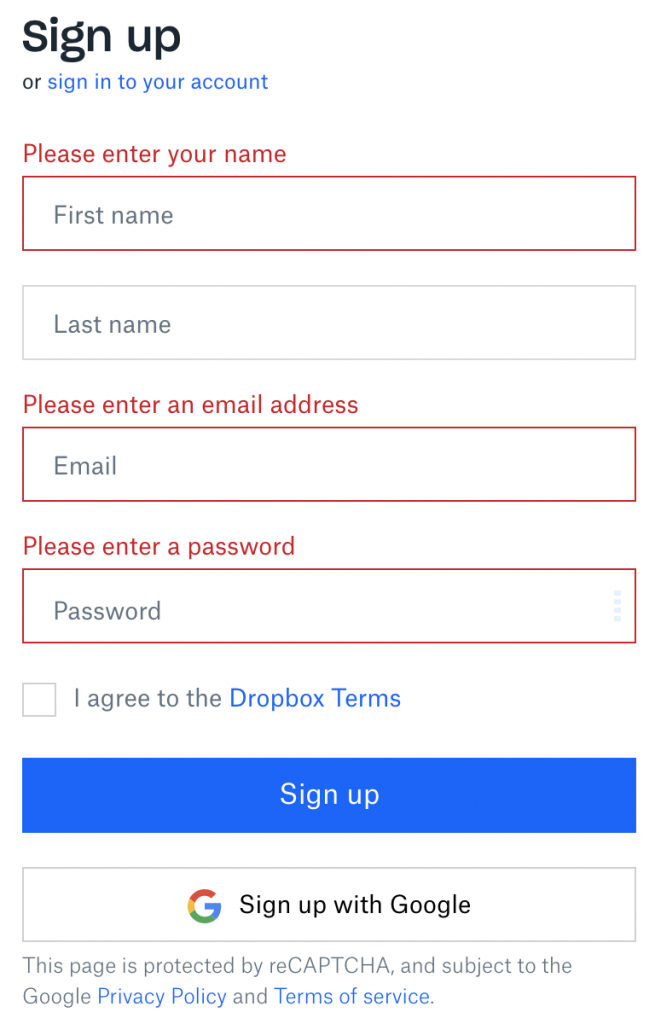
This error message design gallery showcases examples of error messages which follow error message UX design best practices.
These include using clear writing, keeping error messages short and understandable, not using technical jargon, talking to the user in human language, being specific about the problem encountered, and giving clear direction to the user how to resolve the error.

