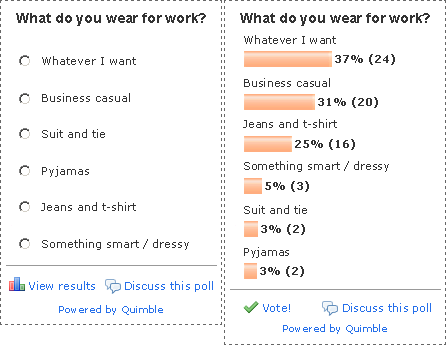
Recently I posted a poll asking what people in the web industry wear to work. I used a free service called Quimble. Seeing as their tag line is “polls done right” (a very bold statement) I decided to post my thoughts about my polling experience.
Firstly, here’s how the poll looks, before and after you take it:

What I Liked
- It’s quick and easy to set up a poll
- You can easily edit your poll once you’ve created it
- The poll has a reasonably clean and simple design
With easy registration, set up and deployment, there’s much to like about Quimble. But as for “polls done right”, well I had a few quibbles.
Opportunities for Improvement
Take Poll Screen
1) Underlining the heading makes it look like a link. It also adds unnecessary clutter. I’m not keen on the font color either – it is rather low contrast and might be hard for some people to read.
2) Using a button for each option makes it seem like you can make more than one choice – they look like fancy check boxes.
Better to use radio buttons, which clearly indicate that you can only choose once. Polls typically use the radio button format, so it makes sense to stick with convention.
I’m undecided as to whether or not you need a voting button to submit your choice. This gives you the option to change your mind once you’ve selected an option, but I’m not sure that most people would need this.
However, if you used radio buttons, users might expect to click on a separate submit button after they make a choice. I would need to test this to be sure of the best solution.
3) There’s no option to view results. If, having taken the poll, I come back to it later, I am presented with the blank poll again.
It’s only after clicking on an option (at which point the poll reminds me that I’ve already voted) that I can see the results. This is not intuitive. If you’ve already taken the poll, when you return to the page, it should display the results.
In addition, sometimes I won’t have an opinion on a subject but would like to see how others have voted. However, I don’t want to take the poll so as not to skew the numbers. Therefore, I need a “view results” link.
4) I’m not sure why “Discuss this poll at Quimble” is given such prominence. I don’t believe this is something people taking polls typically want to do.
I’m not against including this feature, but it’s more of a ‘nice to have’. In addition, putting it at the top breaks up the flow of the poll.
The flow of user actions should go – read the subject, take the poll, and then decide whether you want to discuss it further. Hence, it should be below the poll.
Also, the ‘user’ icon doesn’t relate to the option to discuss the poll. Better to use a comments icon, which more clearly represents a conversation.
5) “This poll powered by Quimble” should be reduced to “Powered by Quimble”. A small detail, but again, it cuts down on clutter while conveying the same amount of information.
6) Some of my site styles have been applied to the poll (e.g. link underlining) and have clashed with its default styling. The poll should either have less default formatting or should override any styles on my site.
Results Screen
1) On the results screen, the number of responses for each answer should be to the right of the bar, for easier reading. This is especially true when there are relatively few responses for a particular answer.
2) The results should include percentages. The absolute number of people responding to each answer is actually not that important.
What is important is the percentage of total respondants as this shows the relative popularity of each option much more clearly.
3) It would probably be a good idea to display the answers in descending order from most popular at the top to least at the bottom.
Intuitively, this seems like a better way for people to quickly understanding the ranking of the results. However, I would want to test this out to be sure.
My Redesigned Poll
As with anything that involves user interaction, online polls are actually quite tricky to design. I came up with the nine suggestions above without spending a great deal of time thinking about the poll or doing any user testing.
Based on my own feedback, I thought I would have a quick go at redesigning the poll:

Note: the results screen is how it would look if someone just clicked on the ‘View results’ link without taking the poll.
Your Thoughts?
I’m sure I haven’t thought of everything. You may even disagree with me on some points. What have I missed or got wrong?
I think most of these are good points and would enhance the overall poll taking experience.
But, I’d have to disagree on the whole rearranging the results in order idea. It might be fine after you click on “view results” link you added at the bottom, but if I’ve just clicked my choice it’d be jarring for me to see it move around in the list.
Tom – that’s a good point; you may very well be right.
This would definitely be something that I’d want to test to find out the majority preference.
It just goes to show how dangerous it is to design for yourself. What makes sense to me may not make sense to the people who are using my site/application.
In this instance, I may very well be in the minority when it comes to how people prefer the results to be ordered.