Before you read any further, answer this question:
If you were designing the zoom slider for an online map interface, would you put zoom in at the top of the slider and zoom out at the bottom, or the reverse?
The reason I ask is because I recently happened to be looking at a map on MSN. I went to zoom in and instinctively moved to click towards the top of the slider.
However, as I did I realized that the zoom slider was laid out in reverse with zoom in towards the bottom and zoom out towards the top.
That felt counterintuitive to me, although, on reflection I’m not sure I can say why.
In fact, I can see an argument for putting zoom in at the bottom, signifying that you’re getting closer to the earth, and zoom out at the top, representing going further and further up into the sky.
However, for me at least, it feels more natural for zoom in to be at the top (and be damned with logic).
A ‘Zoom In’ Convention?
Indeed, I could swear that the other major mapping sites had zoom in at the top of their sliders.
If this was a design convention as I thought, would it be a good idea for MSN break it, even if they felt they had valid reasons to do so?
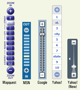
So, I had a look at the other sites to test my hypothesis. Here’s what I found:

Mapquest, Google and Yahoo! have zoom in towards the top of their sliders (although it’s interesting to note that Yahoo!’s new mapping service turns the tables on its predecessor and puts zoom in at the bottom).
With a 3:2 split, there’s certainly not a convention towards having zoom in at the top. In any case, I suspect that the sample size is a little too small to make any generalizations. However, I’d love to know why Yahoo! changed their minds.
Does it Matter?
So, does it matter whether zoom in is towards the top or bottom? That’s a good question. It mattered to me, because I almost clicked on the wrong button.
Do I represent the majority of users? I’ve no idea. If anyone cares to comment, I suspect that there will be a similar split in the responses.
Here’s a thought: I wonder if there are ethnographic preferences towards zoom in being at the top or bottom?
If there are, perhaps it would be a good idea for the mapping sites to add some degree of personalization to their services – now there’s a way to differentiate yourself from your competitors.
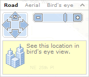
Interestingly, Windows Live Local avoids the whole issue by using a horizontal slider:

Personally, I prefer a vertical orientation, but it may well be that there is no overall user consensus as to whether the slider should go up-down or side-to-side.
Sidenote: thinking of a succinct, descriptive title for this post was an absolute nightmare. If you think my final choice is bad, you should have seen what I discarded.