Whenever I see things online that don’t make sense to me I always wonder “Why did they do that?” I suspect there must have been a reason, but in most cases I’ll never know.
Here are a few sites that have made me wonder recently.
FIFA World Cup

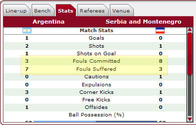
Because of the time difference between Seattle and Germany, I’ve been following a lot of the World Cup matches via FIFA’s MatchCast service.
They do a good job of fitting a lot of information into a small area, but is it really necessary to include fouls committed and suffered?
After all, won’t the number of fouls committed by team A be equal to the number suffered by team B?
Of course, in this instance (see screenshot), they are not – and I haven’t a clue why. Who can you commit a foul against other than the opposing team? The ref? Yourself?
How Many Levels of Navigation?

The KIRO 7 web site obviously believes more navigation is better. Surely this can’t have been tested with users.
Four rows of navigation?! I’ve got to believe that there are some (huge) usability issues with this arrangement.
Sidenote: Jared Spool has written a great article about creating link rich home pages.
Tag Clouds for Non-Techies?

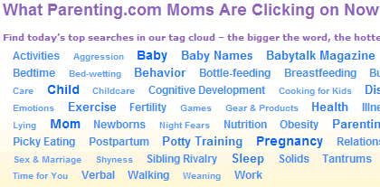
Parenting.com has adopted an interesting way to display popular search results and conceptually I think it works rather well.
However, I wonder if this format is appropriate for the audience to this web site – non-technical mothers. This concern seems to be backed up by the fact that the concept of the tag cloud has to be explained above it.
User-Generated Tag Cloud or Not?
On closer examination, I’m not buying that this is a user-generated tag cloud. These terms look like they have been written by the site’s editors.
I mean, who’s really going to be using the phrases “back talk” or “gear & products” to search for things?
So, either these terms were created by the site’s editors based on user search data, or they just made them up. I’m beginning believe the latter.
I even wonder if the relative importance given to the different terms is based on any actual user data.
Check Marks or Vs?

Although these are supposed to be check marks, they look more like capital V’s. How hard would it be to make them a bit clearer?
… on TagClouds
I think TagClouds are “usable” enough to non-tech people. Big=Important, or Big=Popular… i think it’s easy to understand.
Yes an explanation of this was worth to do…
… on eBay
eBay had always strange ideas of design and usability… for me (tech-people) is hard to browse in eBay!!
In my opinion, they have to re-design most of eBay pages… it reminds me Amazon: plenty of information written in the page without order… bleah…
*greenkey* – I’m not so convinced about the usability of tag clouds.
Here’s an example from Technorati:
Other than *Iraq*, *Microsoft* and *world cup*, everything else seems to blend in together.
How is this better than a table or a list? And, why are the tags listed in alphabetical order? If you’re trying to show what tags are the most popular, wouldn’t it be better to list them in order of popularity?
This would be an interesting topic for a formal usability research study.
Two comments
1. How many Levels of Navigation:
It’s not only the mentioned station that sports such a horrible design – many local network affiliates are obviously served by just one company providing this “design”. It’s not only the navigation shown that is mindbugglingly bad – the rest of the site(s) don not fair better in all areas.
I wonder, if those responsible for deciding on the design actually know, how good and entertaining the web can be. And TV stations certainly have plenty of content to offer. However – judging by the poor design choices made throughout the country – they don’t really seem to care.
2: Tag clouds
If you ask me – it’s a horrible view – taking a lot of space away that could be used for more productive things.
But if you want to achieve entering the Web 2.0 club
AND want to have your site look cluttered – it’s a perfect choice.
Addendum:
Just looked up who does the websites for all these stations. It’s a company called Internet Broadcasting (http://www.ibsys.com).
They recently “changed” the “design” in many stations – now you have an endless vertical array of links that let’s you scroll two screenheights. So just a shift from horizontal to vertical user unfriendliness.
The station you mentioned is also an IBSYS Client.
*kjpweb* – it’s strange why these TV station sites are generally so horrible.
Within reason, there’s a clear ROI on good design – visitors will be able to use your site and thus be more likely to stay longer and/or come back more regularly.
I just don’t get why these templated systems have to create such ugly looking sites. Perhaps they have a lot of legacy issues to deal with which means that they are limited in the improvements they can make to the way their tools work?
I don’t know; it’s beyond me!
Yeah – usually true – but it seems that the rulebook went out the window there…
(On the other hand – looking at what these stations fabricate as news – why should I be surprised if they have a similarly distorted view, on what a website should look like…)
Funny however – that stations usually fighting each other use the same “design”. In case of Orlando – NBC, ABC and CBS affiliates. Sort of weird. Or an indication that they rather not have an emphasis on the web…