Not that this is a new phenomena, but I’ve been noticing icons popping up in the navigation of a number of web sites recently.
As much as I appreciate the craftsmanship that goes into designing these often beautiful graphics, I have mixed feelings about the time and effort it must take.
Let’s assume that time spent designing these navigation icons equates to time not spent doing something else on a web site (say, working on other aspects of the design or improving usability).
That being the case, I have to question whether the benefit gained from adding icons to a site for navigation purposes (in terms of usability) outweighs the cost of developing them.
So, what is the purpose of icons anyway? The Gnome Developer’s Site says it well on their page on designing effective icons:
Icons should be suggestive of the functionality with which they are associated. The best icon will suggest to the user the primary purpose of the program or operation without having to read accompanying text.
If you have to think about an icon to ‘get it’, the metaphor is too complex.
I use this definition in judging the effectiveness of web site navigation icons. Unless they add meaning to a navigation item, what purpose do they serve other than to look pretty / clutter up the navbar?
The following examples help to illustrate what I mean. Take a look at them and see if you can tell what the navigation link would be if only the icon and not the accompanying text was present:

Only the Home and RSS icons have any meaning without their accompanying text because they are universally recognized.
This illustrates the main problem with web site navigation icons; only a few terms (e.g., home, contact, calendar, shopping cart) are used consistently across web sites so that icons can be used effectively to represent them.

Although these images are trying to serve the same purpose as icons they don’t work at all well. The text is made small to the point of unreadability in order to fit both image and text within the navigation space.

Only Home and Login have any meaning without the accompanying text.
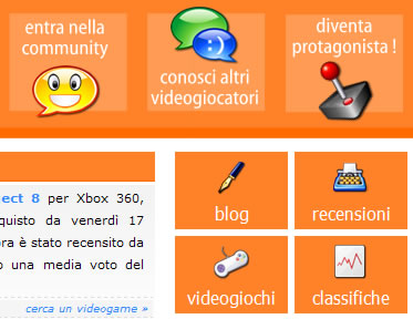
This example illustrates the point that icons don’t serve their purpose if they don’t convey meaning. Because I don’t speak Italian I have no clue what these navigation choices are despite the presence of these wonderfully designed icons.

Only the calendar icon works by itself. The bundles of dollars almost do, but it could be easy for someone to misinterpret what they are. It would have been better to use a simple $ sign, but that was probably thought to be too obvious.
Can you imagine the time (designing, discussing, approving) that must have gone into creating these meaningless icons? Surely there is something else on this site that could have benefited more from this extra time.
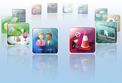
Although nicely designed, these icons are clearly meaningless.
However, they also spin around in a circle making it hard to mouse over them to find out what they are for. It’s even to actually click on one.
To my mind this is the worst example I have found — a complete usability disaster.

On a travel site, some of these icons have meaning (flights, car rental). But the others? At least the designer didn’t even bother trying to come up with an icon for ‘Blog’. If only they’d done the same for the other navigation options.
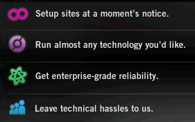
I have no clue what any of these icons are supposed to mean.

These icons do not provide any added meaning compared with their textual counterparts. In fact, the first one actually hinders meaning as the text is so hard to read.
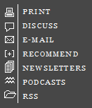
Some of these icons work as they are used universally — Print, Discuss, Email. The others do not help at all, and the RSS one is actually wrong now that there is a standard RSS icon.
The Podcasts icon makes me smile; however, an iPod icon might have been more effective.

Interestingly, this is only example I could find from the web site of a company that actually designs icons. Surely there is a lesson to be followed if the people who know the most about icon design don’t use them in their own site navigation.

Wonderfully designed icons that integrate beautifully into the site design. However, how much meaning some of them provide is questionable.

Of the eight icons here, only four mean anything to me (skiing, canoeing, hiking, cycling). The others could signify anything. Perhaps the two on the right represent fireworks and target shooting?
Conclusions About Icon-based Navigation
Given how poorly icons work for most aspects of web site navigation, I have to conclude that the cost to develop them is not worth it.
I’ll admit that when well-designed they look nice, but if you removed from a site it would be none the worse for it. Valuable design time would most likely be better spent elsewhere.
I would think that at first glance some of the icons are meaningless, but I would say that it’s not pointless to have them as long as there is accompanied text descriptions either with the icon or as mouseover/status bar context. While users would have to learn them the first time, the more they use the site the quicker they will be able to navigate it. (this is of course assuming that a user would return to the site) Images are easier to use than reading text, you don’t even have to have your full focus on them once you know them.
“Let’s assume that time spent designing these navigation icons equates to time not spent doing something else on a web siteâ€
That sentence is assuming that the site developer is also doing all graphic design, and in that case would be feasible. But many companies/government offices have an entire graphics department or contractors that do just that type of thing and site developers don’t have to waste time on that at all
🙂
While possibly meaningless, a lot of those icons still add a fair amount of style to the sites. True, an icon should be reflective of the link it accompanies, but if it’s not, at least let it look good and a lot of these did just that.
Are you saying that these sites would be better off without the icons? I think a few of them would look very plain and benefit greatly from the extra flair.
Sometimes it’s tough to come up with an icon that conveys meaning for something. Great article.
‘name’ — I wouldn’t make the assumption that users will be coming back to a web site often and therefore meaningless icons can become useful over time. Moreover, I question whether they add an real (i.e. useful) value as a navigation aid (even if they are meaningful) when accompanied by text.
To your second point, someone in that graphics department is going to have to design these icons. And there would likely be a considerable review process to get them ‘just right’. I would argue that this time could be better spent on something else, or the money saved on not using a contractor.
*Tom* — I’m not arguing that many of these navigation icons aren’t beautifully designed; they are, and they do add a certain amount of ‘style’ or ‘flair’. However, they don’t add any functional value, and from a business perspective (i.e. cost/benefit) cannot be justified.
I’ve yet to build a web site where we were able to do all of the things we wanted that would actually be of benefit to the user. That being the case, creating navigation icons would be way down my list of priorities.
In regards to Toms point, I think they are mainly used as eye-candy for websites too make them look nice and web 2.0-ish!
These dudes at Simplebits design icons etc for the web, some are nice but I still agree with your main points
I mostly agree. Because there’s no recognizable standards for icons, I think they’re a waste of time. The only acception that makes sense at this point is the Feed icon. Maybe Email and home, but probably not. The Feed icon, however, is a standardized icon.
Funny you discuss the wasteful use of time regarding the design of icons for web site navigation, a poignant article as people are beginning to waste so much time reading idle blathering of other internet denizens as blogs have become so popular. Seems funny though, I wonder what wonderful things you could have achieved in place of wasting valuable time looking up all these references and writing this article. Hmm, maybe you could have designed a better site?
I agree with mostly everything stated, but I don’t think that icons necessarily have to stand on their own to be effective or that they are there just to add beauty either. I think they can serve very well for drawing the eye to specific points and emphasizing the text and whole meaning.
To me, it’s like using stock photos in some instances. If you view them alone, they don’t always have one specific or very obvious meaning, but used in conjunction with the text, can emphasize the whole meaning.
I agree though that putting icons up that without specific or standard meanings and without text is a waste of time.
*Jeremiah* — it’s a matter of opinion whether the research I did in writing this post was a waste of time. I’d say not as it as helped to understand better the field in which I work.
As for designing a ‘better site’, I’d love to know what you mean specifically. Are you talking about visual aesthetics or real issues of usability? My main criteria for ‘good’ blog design is that the content is easy to read. I think I fulfil that. Everything else is secondary in my opinion.
*Naomi* — I agree that icons can add to the visual appeal of a site (or they can just add clutter depending on the designer). My main issue concerns the practical value they add compared with the cost of their development.
Thank you so much for writing this post. I have long told clients and associates that in my opinion – if you need to put text next to an icon in order for a user to “get it” than the icon is worthless.
The entire point of an icon, for me anyway, is to communicate a message (functionality, emotion, etc.) without using text.
This reminds me of a book I have, Don’t Make Me Think.
I mostly agree. However, I would make the argument that icons can break up the text and the navigation and set the links off as such. Also, although a lot of the icons you have listed could not have worked effectively by themselves, I think they are context sensitive, and unless the designer has left them all alone, they shouldn’t be judged that way. Nice article though.
Style is functionality. Even if these icons don’t convey a direct meaning (which is really hard in a few seconds), they can change the way you feel about a site and how you use it. Which is function on it’s own.
I agree that icons aren’t the first thing you have to worry about, but they can be very important.
Check out dLife.com, we used a lot of icons on the site to show clear paths into the top performers. Our site has been featured in another article about icons in the nav bar.
It may have been said (it’s hard to say anything new these days) but if an icon helps the concept, then it’s worth having. You’ve gone around the web and pulled a lot of bad examples, but you’re just going to have things done badly as large as the web is…
Icons provide visual anchors for people’s eyes. On a second visit, I may do a quick scan for a unique icon that I remember from last time. It may speed up my browsing experience.
There’s lots of great things about icons… but like anything they can really suck when done poorly.
Some great examples, and this supports how I have felt about icons for a long time. The obvious usability mistake from some of these examples is simply that we should only use standardised icons that are well known like the rss, or home icon. Though I do think they look pretty.
All symbols are by their very nature arbitrarily assigned. Just like a red octagon has been ingrained as “stop”, a right-facing triangle is “play”, and an exclaimation point means caution.
Icons for site navigation work like a legend for a map. Once you learn what symbol denotes what word, you can arguably browse that site faster in the future. Additionally, despite a recent drive towards minimalism in web design, sometimes its not a bad idea to add some embellishment and subtle richness to a design – icons are a perfect way to do that. It doesn’t have to just be about utility – icons can serve aesthetic means too.
Wow, Christian, this is one of your best articles yet! I particularly like how so many people commented, and one guy even seemed to get a little nasty. You must be saying something worth saying!
What I get from what you’ve said is “Do navigation icons last.” People building a site on a budget should keep this lesson in mind. If your designer comes to you with icon designs out of the gate, start worrying!
If you have a big budget, or want to _look_ like you have a big budget, you may want to consider icons, but think of them primarily as decoration.
While I do kinda agree with your point (even though I am on your list as a ‘bad’ example 🙁 ), this point about not adding any functional value and what a lot of other people have said about using standardised icons I don’t agree with. Because if you’re going to take that argument further you wouldn’t bother spending time coming up with the right colour palette or working on your typography (something which you’ve written about in the past as being worthwhile) or other decorative images or graphics, or even writing good copy cos we know people only skim anyway.
In fact, a lot of things that could be considered as making a site unique would be done away with if we follow this sort of argument.
Icons might have a text description just if you point the mouse over them, or a text description, however I think they imprve the look of the site.
Thanks for the article 😉
Icons are usefull if they are actually used for navigation purposes and clearly show what their purpose is. If their only purpose is eye candy they look confusing.
*Ian* (#15) – I’ve just been noting these icons as I’ve been surfing the web. The reason that I didn’t present any ‘good’ examples is because I couldn’t find any.
I’d love to hear of any sets of navigation icons that really serve their purpose.
*Rob* (#17) – As for enabling people to find something faster the second time, this may or may not be true. I would suggest that someone would have to visit a web site many times in order for a particular set of navigation icons to become useful.
This being the case, my argument is that the time spent developing icons for navigation could be better employed on something more ‘useful’.
*John* (#19) – I’m not suggesting that aesthetics aren’t worthwhile. However, I believe there is a law of diminishing returns when it comes to design. After a certain point, additional work stops adding ‘useful’ value to a site — i.e., there comes a point where you have to say “It’s done”.
It’s my opinion that navigation icons don’t add value commensurate with the time invested in producing them.
Thank you for this great post. I will have my designers look in to this post and learn valueable things. I was just wondering if icons can affect your SEO efforts? Do search engines like sites with lot of graphics and Icons, if not, how can we build a cool website while still maintain good ranking for SEO?
It’s a big stretch of an assumption to make I feel that icons or anything else that add to the visual appeal of a website are added at the expense of time spent on usability and accessibility.
Not only, as has been already mentioned, can icons serve the purpose of being easier to navigate than text only once a user is a regular visitor and becomes used to the meaning behind each icon….they also look nice! 🙂
If web design was only purely about usability and nothing more, the Internet would be a very ugly place.
Good attractive design, including the use of icons, can go hand in hand with a well built, usuable, and accessible web site.
Icons can interfere with seo efforts if they are the only means by which a search engine spider can navigate the website …however they can easily be backed up by duplicate plain .html navigation links at the bottom of the page just for the spiders.
italian text in the picture means:
entra nella community->join the community
conosci altri videogiocatori->meet other players
diventa protagonista->be the protagonist
recensioni->reviews
videogiochi->videogames
classifiche->charts
*Amanda* — actually, I wish more web design was about usability and less about aesthetics. On the whole I think this would make the Internet a much better place.
Yes, in an *ideal world*, all these elements can go hand-in-hand, but in the *real world*, they tend not to.
This focus on aesthetics means that more ‘mundane’ things like usability, readability, and so on get pushed aside.
Where’s the ROI on adding icons to a web site?
If I had $1000 to spend on a home page, would it be better spent on adding some navigation icons or on running the content through a few more rounds of edits for readability and SEO?
navigation should be all about making it easy for people to move about your site i always use an unordered list and use css to style it also icons can have accessiblilty issues people using lynx won’t even see them
also i belive icons are a waste of time if you use properly formated text it will help you from a seo point of view
I think the primary function of design is to provide solution. As far as form is part of the function, anything that can make a site more attractive can increase its look appeal and be inviting to visitors. With that in mind the designer should focus on delivering the message to the target audience in an efficient manner. An icon should be suggestive to its intended use. In real life there are some concept so abstract, they’re very hard to iconize. Does it mean that we, as designer should give up. I think it’s fortunate that some creative people have tried new approaches that institutionalized some icons that may not have been that ‘understandable’ in the beginning – case in point, the Apple Command icon!
I’ve always been of the opinion that although icons don’t necessarily add to the understanding of a site on first use, it’s repeat use that the icons come into play. People remember icons much more quickly than recognizing text. So if you use a site often, you remember the icon and look for it on the page, clicking before you even read the text. Therefore, well developed icons will increase users enjoyment of the site because they will be able to browse through it much more quickly.