I recently read a great article on Boxes and Arrows about the myth of the fold. Turning to the sidebar to learn more about the author, I was struck by some of the design decisions that had been made regarding this part of the page, most notably the choice to right-align all the sidebar content.
As I looked a little deeper I began to wonder how much more readable the content would be if it was left-aligned and paragraphs were used.
How might the visual design be improved if more differentiation was made between the sections? What if the text was a little smaller to better separate it from the article? And so on.
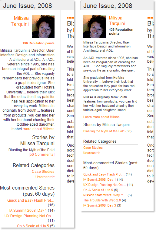
I couldn’t resist firing up the ‘Edit HTML’ feature of the Web Developer toolbar to find out. Here are the results of 20 minutes or so of tweaking:

The original Boxes and Arrows article sidebar is on the left and my version is on the right.
Note: I edited down the long bio text in both examples for the sake of this experiment.
Clearly, the left-aligned content is easier to read. I also find that the smaller text is still very readable because of the use of paragraphs and that the whole sidebar is more scannable because it takes up less vertical space.
I like the way the revised sidebar is more distinct from and subordinate to the article content. Given more time I would likely experiment more here, perhaps through the use of different font styles (capitals or italics) and colors (other shades of gray).
I find the ‘most commented stories’ section, in particular, to be much easier to scan in my version. It really doesn’t work in the original.
I also ‘fixed’ some odd design choices. In the original example, the ‘Blasting the Myth of the Fold’ link is not colored orange like the rest of the links.
However, the ‘136 Reputation points’ text is colored orange but is not a link.
So, what do you think of the revised version — better or worse?