Interbrand recently published their 2008 list of the best global brands. I thought it would be educational to take a look at the websites for these brands and see how they compared.
After all, the top brands in the world should likely have web sites that display a similar level of quality, right?
As expected, most of them were pretty good. Some were even great. However, there were a few surprises too, which I thought I would share here. Enjoy.
Note: when a site’s top level domain took me to a country picker, I chose USA.
#1 Coca-Cola
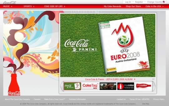
Not a great start, especially from the world’s top brand. There’s nothing really to do on this page, and it doesn’t feel particularly inviting or aspirational.
The visual design is pedestrian and the flash carousel is sloppily implemented. I certainly don’t feel encouraged to explore any further.
#8 McDonalds
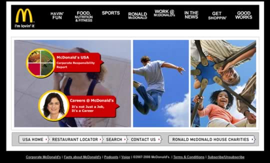
Sorry, but you have got to be kidding. When I first arrived at this site I thought I had accidentally ended up at the wrong web site.
This is McDonald’s? Yes, nothing says “I’m loving it” like like loads of black. And those lame Flash animations. I especially like how if you mouse over the navigation and move away, half the time it disappears!
Viewing this web site I feel like I’m going through the Wayback machine.
#14 Gillette
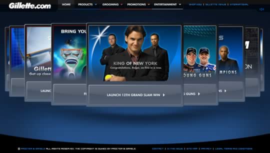
My patience in waiting for the site to load was rewarded with … a giant carousel with even more panels than their latest shaver has blades.
Many more. It’s all very ‘hi-tech’ and all but if you move your mouse too far to the left or right you risk motion sickness from watching the carousel spin.
#16 Yves saint Laurent

This is not a home page, it’s a poster. Wasted opportunity.
#18 Marlboro
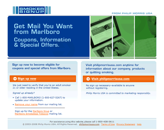
From a branding perspective, can you even tell that you’re on the Marlboro site?
I get it as a cigarette brand they are limited in what they can do, but how about a little design. This page is just plain ugly.
Take a look at Camel and Kool for examples of how a little branding can be applied.
#39 Kelloggs
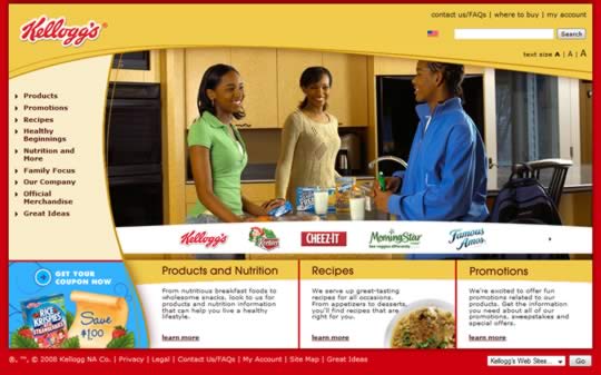
Simply put, this site looks years out of date. It doesn’t help that the design looks like it came from a (bad) web site template store.
#47 Accenture
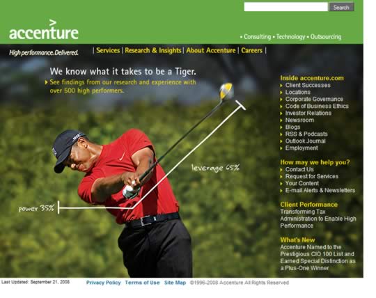
This really is the home page for the world’s largest consulting firm? Where exactly is the design? Oh, and try mousing over the main navbar for some really out-of-context fly out navigation.
#61 Wrigley
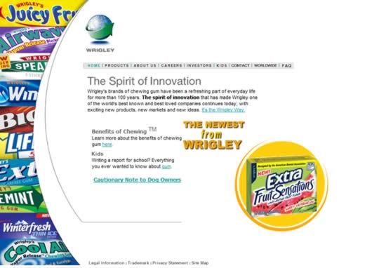
This site looks like it was designed about 10 years ago by someone’s nephew who was into computers and did some of that ‘web design’ on the side.
I love the large “Cautionary Note to Dog Owners” link in the center of the page too. Nice touch.
#88 Duracell
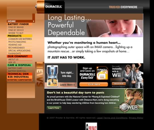
Wow. When was this page designed? Viewing it is like going back in time — it’s just so bad.
From the amateurish Flash intro before you choose your country to the incorrectly sized icon at the bottom of the page, it’s a master class in how not to design a web site.
#93 Ferrari
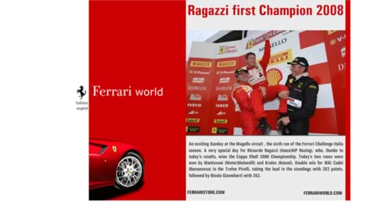
After really annoying me by pointlessly maximizing my browser window, I’m now presented with this?
This is the new user experience Ferrari wants me to have on their web site? Not impressed.