If it’s been a little quiet around here lately, it’s because I’ve been busy with, among other things, launching a new website for Mytheon, the next game from True Games Interactive.
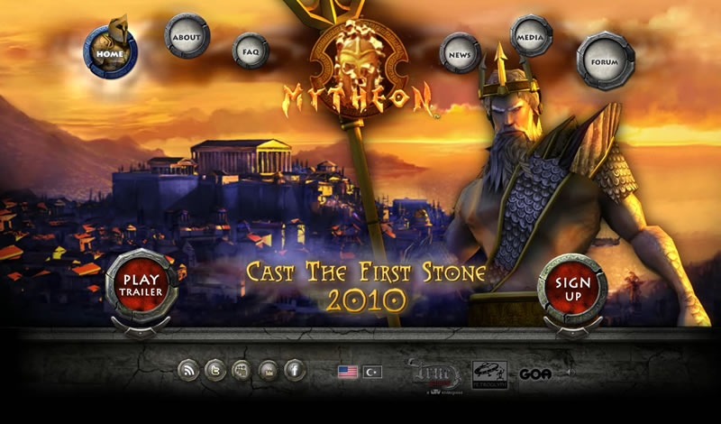
A few months back we launched a teaser website to kick-off marketing for the game.

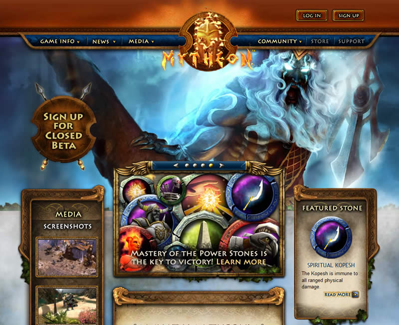
It certainly helped to get the buzz going, but it was never planned to have a long lifespan. And so now it’s been replaced by a full-featured marketing and community site, powered by Drupal.

As project lead, my responsibilities included strategy, IA, wireframes, art direction, writing content, you name it. At least the project management side of things was made a little easier thanks to Basecamp. It really was an invaluable tool.
Initially, I tried out a number of site layouts, especially for the home page. However, after not really finding anything that was especially compelling, I decided to go with a traditional layout that players of MMOGs would be familiar with.
Instead, because the game is so full of lore and mythology, I opted to focus more on the content than just the visuals. In Mytheon players take part in a war between mankind and the gods.
It draws upon various mythologies, starting with Ancient Greece, which makes it a gold mine from a content perspective.
Although, with hundreds of Power Stones (many more to come) for players to use in the game, each of which we intended to have its own page of background and description, there were times where I was concerned that we were biting off very much more than we could chew.
The mythological setting is also why we decided to use Poseidon as our signature character, as he is one of the more recognizable Greek gods.
Because of the great visuals in the game, we also used lots of screenshots for banners and spot art. Many a late night was spent taking those, although it has been interesting to watch the game progress and become increasingly polished with each build.
Another important component of an online game website are the forums.

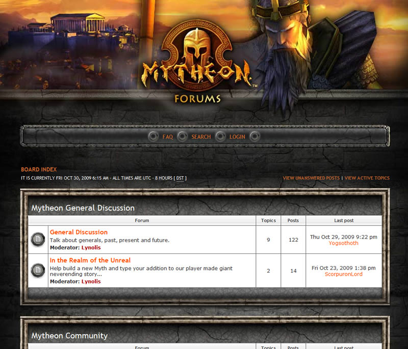
I’ve always been really happy with how our forums turned out. Working with forum software is never the easiest, and I was pleased that we were able to give ours a pretty custom look.
The design for ours is based on the teaser site, but I think it still it ties in pretty well with the new site. It will probably be a candidate for a visual refresh in the months to come though.
You can see more examples of great forum design in my online discussion forums showcase.