Netflix recently overhauled their movie details pages, ostensibly (according to the official blog post) to pull important information to the top of the page, better support episodic content like TV shows, and to make it easier to find similar content.
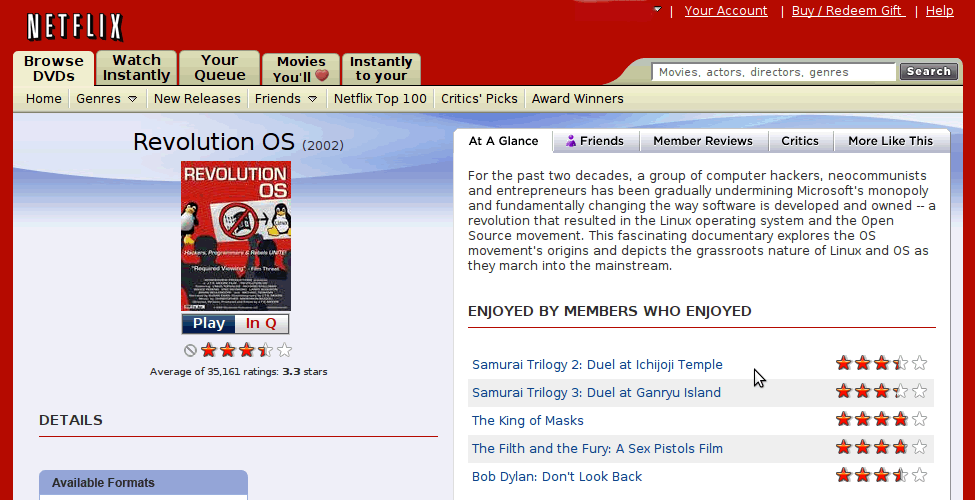
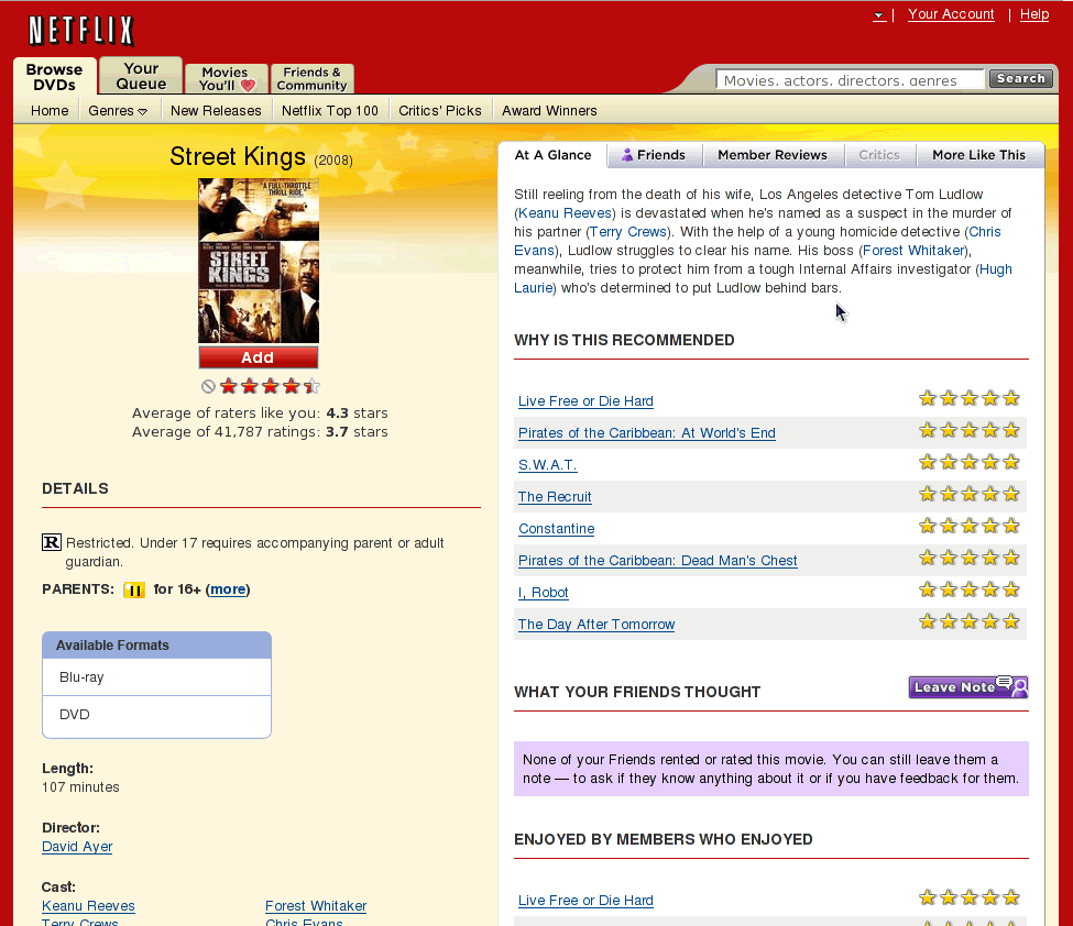
However, what seems to have many in the community up in arms (see comments, here, here, and here) is what’s been taken away — namely social features such as friend reviews and top 10 lists.
It certainly seems like an odd move in this era of social everything, especially given how strongly many users clearly feel about the usefulness of these features. I didn’t use the friends feature very much myself, but I certainly didn’t find that it got in the way of my browsing experience.
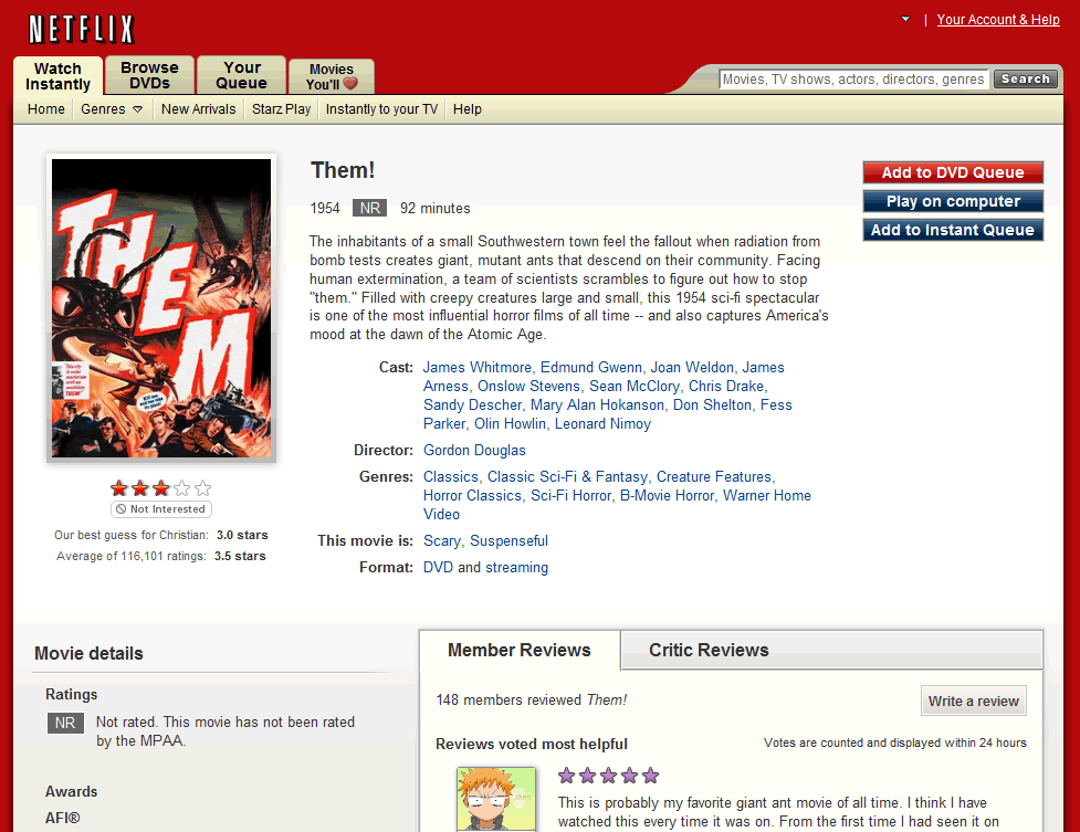
If you compare the new page with a couple of older versions that I found online you can see the differences. The new page is certainly much cleaner in terms of having been stripped away of the features that Netflix had been adding over the years.
Whether that’s a good thing is clearly up for debate.

One significant change I did find surprising is moving the “Add to Queue” button from beneath the movie box shot to the top right of the page. To me it makes a lot more sense to have the button along with the product image and the ratings.

I’m not sure what prompted Netflix to change this particular design element which has been working fine for years. The new position does not help the overall layout of the page at all and seems disassociated with the other information on the page.
Another change that stood out to me in the redesign is that the page now feels rather bland. There is an awful lot of gray and metallic gradients in the new design. This style feels somewhat dated to me and in need of a refresh.

If you’re a Netflix user, I’d be interested to hear your thoughts on the new design and the change of features. Is this an overall improvement or have they ruined the experience of choosing a movie?