A recent report and infographic from ReturnPath shows that mobile email usage has now clearly surpassed its desktop and webmail counterparts, which ties with data from Campaign Monitor showing the same trend.
Given that mobile email use shows no sign of slowing, here are six key best practices, with examples, for creating attractive and effective emails for mobile devices.
1. Focus on Readability
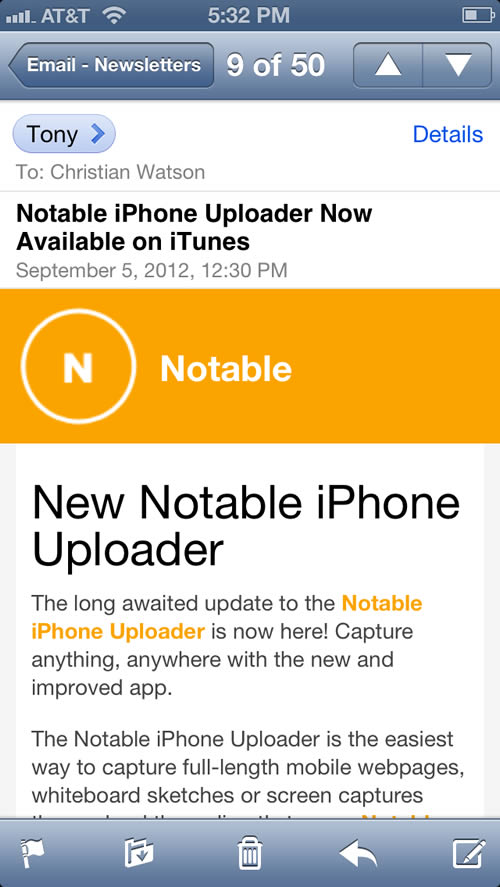
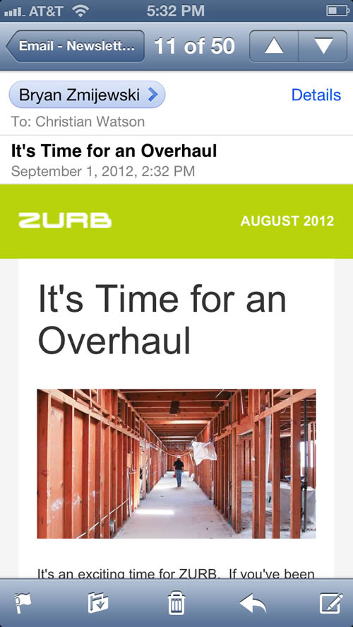
Perhaps the most critical component of an effective mobile email is readability. Therefore, use large body and heading fonts along with sufficient white space help to make emails more readable.
These examples from Notable and Zurb are extremely easy to read on a small screen.
2. Keep Layouts Simple
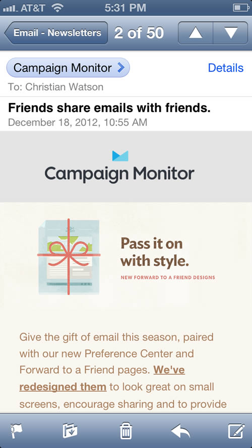
Because of the limited screen size, it’s generally better to use simpler layouts, with a one-column layout being ideal. This example from Campaign Monitor shows good use of this approach and also how a single column email doesn’t have to look ‘boring.’
This email from BackBlaze takes a similar approach, and incorporates inline images by floating them to the left or right of the content.

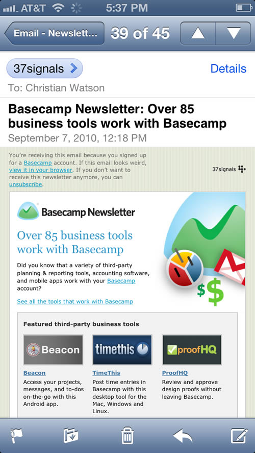
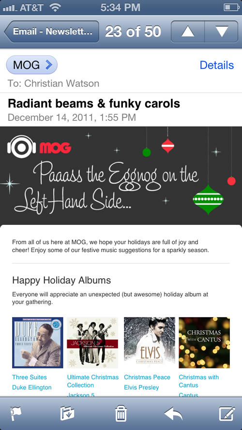
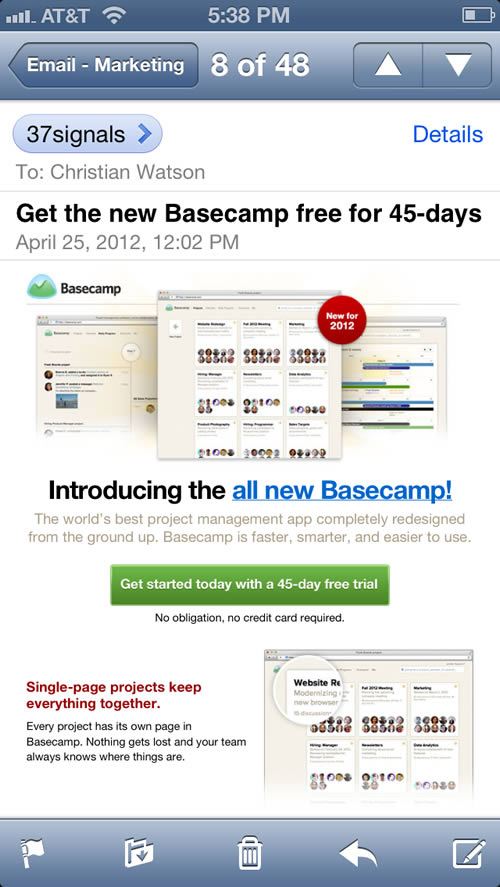
Of course, there are always exceptions to the rule. These emails from 37 Signals and MOG contain multi-column layouts which still manage to be readable and clickable.
If you are adopting a multi-column approach, they key is simplicity – use large images and not too much text.
3. Use Large Click Targets
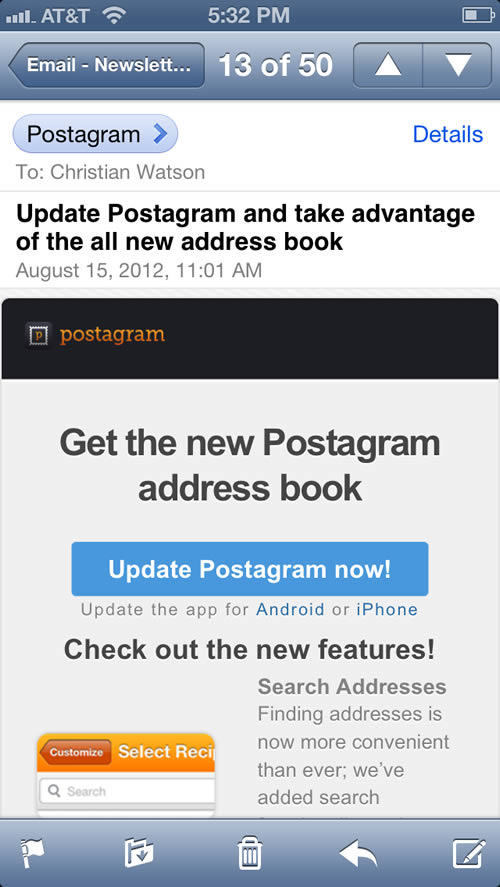
People interact with mobile emails via their hands; therefore, any click targets such as buttons or links need to be large enough to tap on with a finger.
These emails from Postagram and 37 Signals show perfect examples of big, clickable buttons.
4. Keep the Message Simple
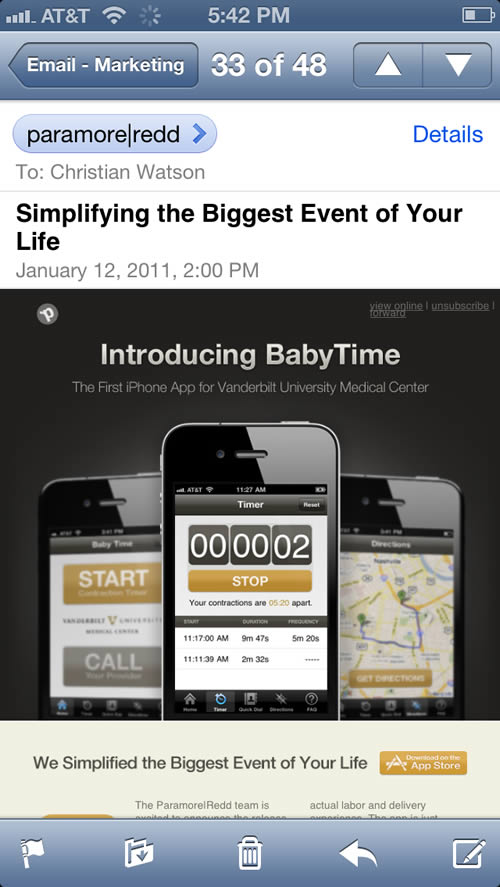
Even more than they do on a desktop, people scan emails on their mobile devices. Moreover, reading on a mobile device is not especially easy, so it is critical for mobile emails to have a clear, concise message.
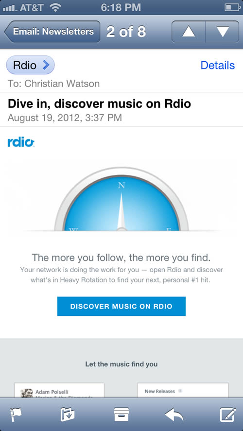
Make one point and make it well. These emails from Paramore|Redd and Rdio are great examples of this principle in action.
5. Cut Away the Clutter
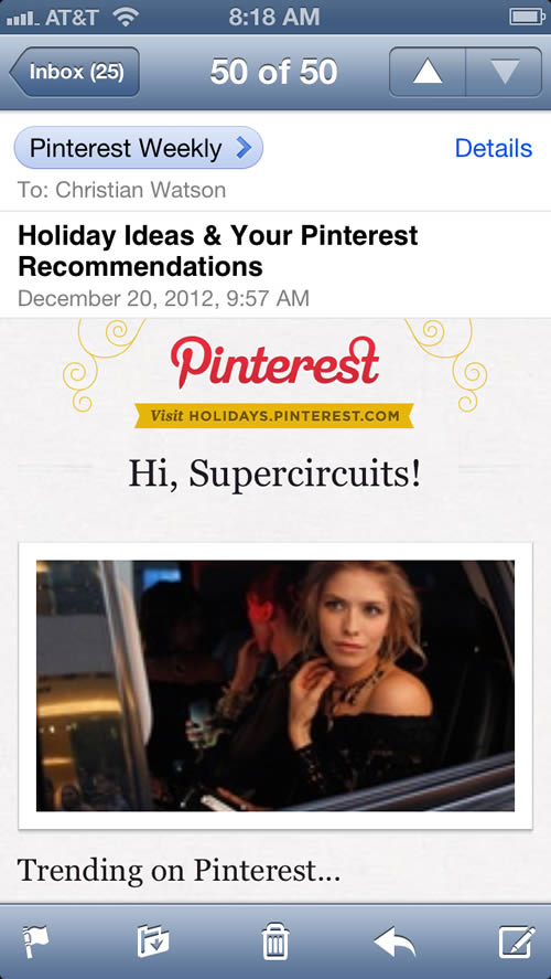
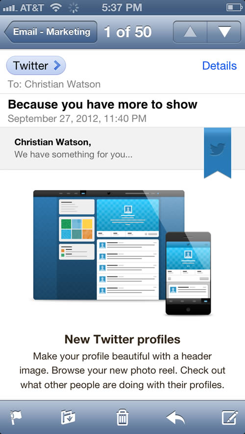
Because of the limited screen real estate, effective mobile emails remove the typical email ‘clutter’, such as navigation and social sharing buttons, in order to present a clean, simple design and keep the email message at the forefront.
These emails from Pinterest and Twitter do this beautifully.
6. Be Bold
Because of their simpler layouts and more minimalist design aesthetic, a common complaint about mobile emails (at least, that I hear a lot) is that they are boring. They don’t have to be!
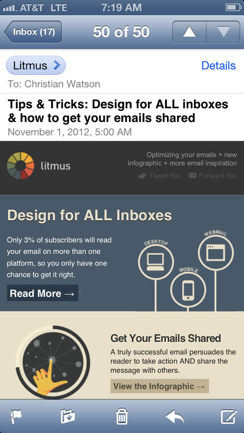
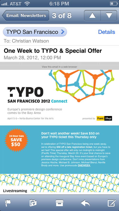
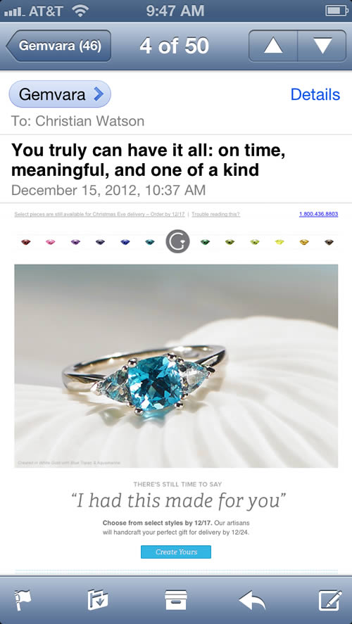
Through bold use of color, images, and typography, mobile emails can be just as visually compelling as their desktop counterparts, as these examples from Litmus and TYPO San Francisco show.
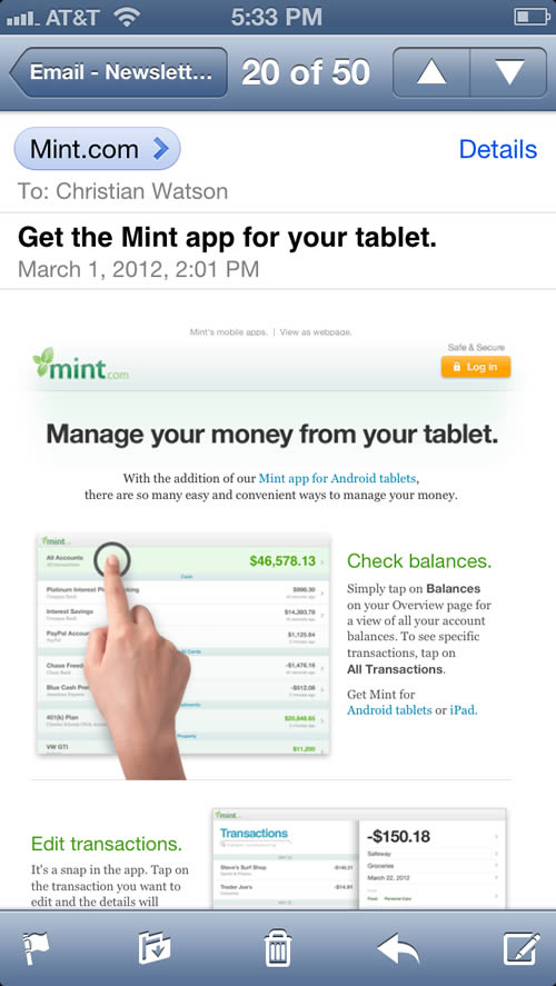
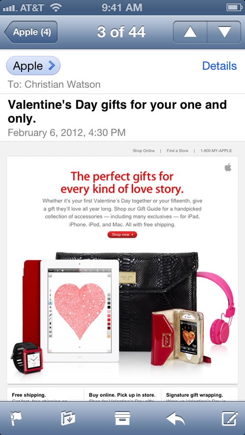
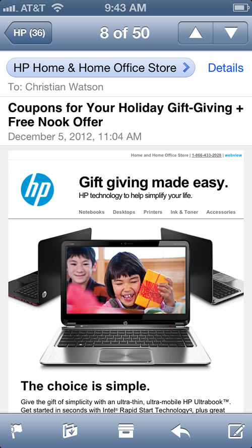
Even More Mobile Email Designs



Keep in mind that many people view their emails in the preview panel. Since the smallest average preview panel is typically between 550 and 600 pixels wide, you should design your emails accordingly. You may even want to consider narrower to accommodate mobile browsers.