I really like this LinkedIn email I received recently. I was just checking my mail before starting some work, when before I knew it 20 minutes had flown by while I clicked around on ex-colleagues to see what job moves they had done in the past year that I hadn’t heard about.
Read MoreAuthor: Christian Watson
Gallery Page Design Showcase: 60 Examples of Excellent Product Category Pages
Although they are an important component of many websites and almost all online stores, very little appears to have been written about designing great category (also known as ‘gallery’) pages.
This is despite the fact the Jared Spool calls them the hardest working pages on your site given the key role they play in directing users to the correct end content. Read More

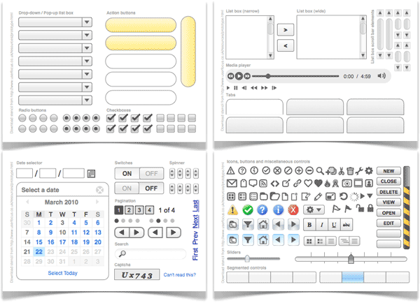
Paper Prototyping UI Elements Kit
This paper prototyping kit from Userfocus will help you to avoid redrawing the same UI elements over and over.
When it comes to iterating on a paper prototype as I refine the design, my favorite tool is Blu-Tack. I’ll draw out the different elements of a page on separate pieces of paper and blu-tack them to the main sheet.
Mega-Menus Can Reduce as well as Enhance Usability
With the ever increasing use of ‘mega-menus’ it’s useful to see an article like the recent one from Jacob Nielsen reminding us that there are still design pitfalls to be overcome in implementing them effectively. Read More
40 Bold Examples of Sale Email Design
When you’re an online retailer and you have a store-wide sale, the best way to announce it is often simply to say so – no example product pictures; just bold, emphatic type matched with a colorful background to make your message stand out. Oh, and a big discount.
Read MoreGood Example of Marketing Email and Landing Page
I liked this combination of offer email and landing page for Google Adwords. Although the design for both is straightforward (as you’d expect from Google), both are well structured with clear layouts, good copywriting and clear calls-to-action.
Read More
Welcome Email Design Showcase
First impressions are hugely important; no less so than when a visitor to your website decides to deepen their relationship with your business by joining your mailing list. How you welcome them is a key first step in establishing that relationship. Read More
Bringing the Human Touch to the Signup Process
I thought these error messages on the Formspring sign-up form were a nice touch. They add a human element to a process that often feels so impersonal, particularly if the user makes a mistake.
Read MoreGiant Collection of Ecommerce Add-To-Cart Buttons
Back in 2007, Get Elastic posted a handy collection of add-to-cart buttons along with some analysis of the label text and use of icons.
I thought it would be useful to revisit this topic and so I gathered together over 200 add-to-cart buttons, including many from the top online retailers.