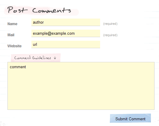
Previously I put together a showcase of interesting and creative blog comment design. It was a fun exercise and fascinating to see the different approaches taken to the standard comment format.

Going through this process, I was also struck by the creativity of the design work that went into some of the comment forms on these sites.
As I’ve been traversing the web since, I’ve been noting sites with comment forms that have that extra design effort put into them and have collected them into a blog comment form design showcase.

I hope you’ll agree that there are some great examples of creative design in there.
The Few and the Brave
It’s been somewhat surprising to see how few blogs put any additional design effort into their comment forms other than to make them readable and usable, even those of designers.
Not that they should have to, of course. There is certainly no need to make comment forms anything more than functional.

However, this shortage certainly makes the comment forms that are more ‘designed’ stand out, be it in terms of field layout, the addition of extra graphical touches or integrating the form more fully into the overall design of the site.
So, for anyone looking for a little design inspiration, hopefully this collection of comment form designs will help in that regard.
Call For Submissions
I’m sure there are plenty of examples of great comment form design that I have missed. If you know of a site that is worth including, please let me know and I’ll take a look.
This is really awesome as I’ve been stumped on how to style the comment form for my own site.
*Christian* – I hope it provides some useful food for thought!
Of course, I’m well aware of the irony that the comment form on my own site has absolutely no additional design whatsoever. One of these days…
The fadtastic site has recently implemented a nice dropdown comment box with a subtle pattern design.
See “this for example”:fadtastic.net/2006/04/22/the-heroic-years-of-graphic-design/ and click on ‘make a comment’ at the top.
That’s a pretty cool list. It definitely gave me some inspiration. Funny that nobody ever thought of showcasing this before…
I have moved the comments to the right column here, currently AJAX’ing it -> The undersigned.
The comments box for this site is pretty hot; also check out his photo blog comments… nic.
Special thanks for the collection of comments and forms. A great idea for inspiration and new solutions.
I will write the tip for german readership.
Blog Design Case Study: Kommantare und Formulare
Kurz vor dem CSS-Reboot gibt es einen aktuellen Beitrag, den so mancher Blogger gern vielleicht etwas früher gelesen haben möchte. Aber noch ist es nicht zu spät. Hier deshalb der kleine Hinweis. Die Kommentar-Design-Studio habe ich denk…
I customized the comment form on my blog in a way that’s hard to explain, so here’s an example.
I’ve always been fond of my comment box. Yea, it may seem a little old now with the rounded corners but I’ve always liked the different colors which match perfectly well with my site design.
Hey there! Thanks for including me in your showcase. 🙂 Now if I could just figure out how to do the live comment preview thing like you, I’d be all set! 😀
*All* – thanks for your feedback and suggestions. I’ll check them out for my next update to the showcase.
*Lindsay* – the live preview uses a script from “Jeff Minard”:jrm.cc/archives/blog/site-news/live-comment-previews/ – it’s not too hard to implement and there are plenty of others available if this one doesn’t do all that you want.
I feel that if someone responds with a post which is relevant to the topic, they should be reworded with the link they leave. Afterall, it’s the topic related responses which work to better serve your blog site.
omg… i’m in the list !
Thanks a lot !
Thanks for showcase. 🙂