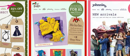
I quickly became a fan of Boden’s emails thanks to their colorful, textured designs. Whether it’s the main brand, Boden, or the two sub-brands, mini Boden and Johnnie b, the emails are always fun and interesting with many delightful design elements.
Which is why I collected over 30 of their emails to showcase their use of layering and combining graphics, type and imagery to great effect (best viewed with your browser maximized).


Their email designs are awesome! I love the use of colour and textures with the attractive layouts. A definite inspiration for someone creating a new email marketing campaign.
Thanks for sharing.
They do look great, but how much of these is actual text? Or are they just a big image? Just wondering from a spam filter point of view.
Those are great email designs. I’m very impressed. But commenting off of what David posted about spamming, if it were one big graphic then when the potential lead opens the email they will not be able to see any images or text until you click on “show images” etc. and in turn people will not be interested because they see the email as spam. Is there a way that the graphics automatically convert to a text?
These email designs are incredible! Considering how hard it can be to make designs like these on websites, managing to incorporate them into an email is quite an achievement. I wonder how hard they were to do from a coding point of view, in terms of keeping it email friendly…
I wanted to see how they structured the HTML email.
really impressive email design. i would like to know from which email sending software it can be the best way to send .
Great email campaign, the designs are colourful and the offers are easily readable. Just what you want an email campaign to be!
Thanks for this fantastic portfolio of email designs. These are all very inspiring 🙂
The best part about these design are they are beautiful and functional. Every design comes with clear call for action areas where the user is motivated to interact.
Wow. That looks like a lot of work. The design looks nice and professional but keeps it fresh and fun at the same time. Not an easy task to pull off. Thanks for posting.
that design is great. Do you also work with drupal?
Because these emails are largely image based, it’s not hard to make them ‘play nice’ with the major email clients. That’s one (big) advantage of using a primarily image-based approach. After all, if someone has chosen to subscribe to your emails, they are going to allow the images to be downloaded — so you don’t have issues with your content not being seen.
Very nice collection. Thanks for collecting these and sharing.
Great use of colour, they would certainly brighten up my inbox!
Wow, these look great. Definitely a great source of inspiration for any future email designs!
Where is the Facebook like button?
Some nice designs you have here. Are they available to download as a template to develop further possibly?
Regards 🙂
Really I like this….email designs…..thanks for sharing….