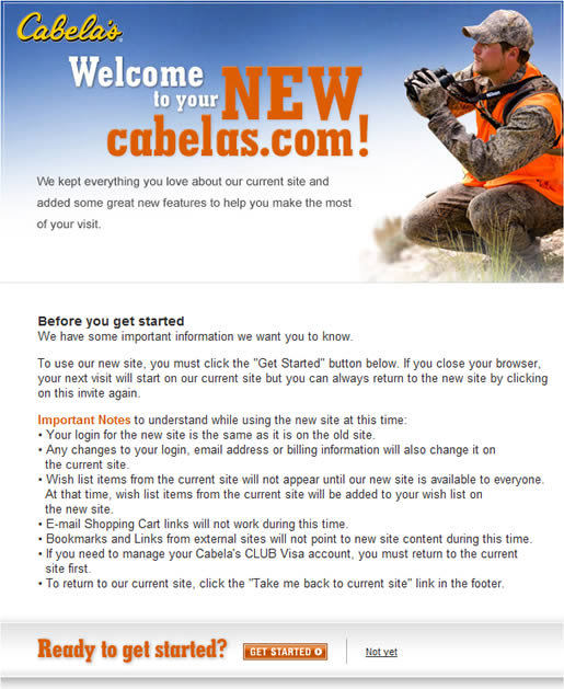
Outdoor gear online retailer Cabela’s is getting ready to launch a long needed redesign. However, it wasn’t the new site itself which caught my attention (although it looks pretty great) but the process they are following to introduce their customers to it.
On the home page of the old site a banner (almost lost in the clutter) announces the new site:

Clicking on the banner takes you to an introductory page explaining key points about using the new site:

The content on this page could be presented a little more clearly for scan readers who are anxious to check out the new site; however, all the information you need is there.
Once on the new site, you can always return to the old site or leave feedback about your experience via buttons in the footer:

The feedback button links to a SurveyMonkey form with four simple questions:
- How often do you visit our current cabelas.com?
- What did you like most about our NEW website?
- What did you like least about our NEW website?
- Additional comments you would like to share about your experience today.
This approach to introducing a website redesign is well thought out, as it should be for an ecommerce site that wants to avoid losing revenue from existing customers who are used to navigating the current website.
It will be interesting to see how long Cabela’s waits before taking the plunge and fully moving over to the new website.
Users tend to stay on what they are familiar with. If a new site or improved site is necessary, the navigation should be similar or if not, easy to navigate. Otherwise, users/customers will get upset or impatient and just drop everything and leave.
http://www.iespro.com is one of the biggest online web designing and web development company in karachi pakistan that also offers seo services