I’m lucky enough to be able to cycle to work a couple of days a week on the Burke-Gilman trail which runs along the shore of Lake Washington.
This being Seattle and me being a fair-weather cyclist, I keep a close eye on the weather forecast so that I can plan my commute methods for each week.
In search of the best forecast, I’ve tried out quite a few weather sites – although I’m still not sure I have a favorite.
From a designer’s standpoint, it’s interesting to see how the design of these weather ‘infographics’ varies from site to site as well as what common themes emerge across them.
Here’s a sampling of weather sites that I’ve used as well as a few others I found, along with a few thoughts about each.
1. Accuweather
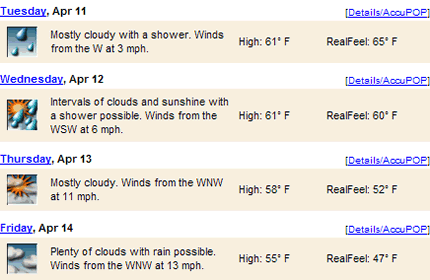
- The ugly, small graphics are hard to understand at a glance.
- The only site not to show the low temperature, which begs the question “does anyone actually care what the low is?”
- Not sure why it is important to show what direction the winds are coming from. Isn’t it enough to know how windy it is?
- What is ‘RealFeel’? Without knowing how this is calculated, I would just ignore it.
2. AOL
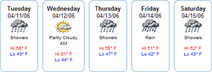
- One of the better graphics. Clean and easy to read.
- Unlike other sites, graphic for ‘rain’ is different to ‘showers’.
- On Wednesday the weather is ‘partly cloudy AM’. I wonder what it will be in the afternoon?
3. AOL City Guide (DigitalCity)

- Cutesy graphics, but I find them appealing. Shame about the ugly brown background.
- Presentation of the low & high temps is a little hard to read. Some spaces wouldn’t go amiss.
4. Areaguides.net

- One of the few sites that has the ‘high’ temperature to the left of the ‘low’ temperature. This seems counter-intuitive to me. I expect the lower figure to be on the left.
- Thursday’s ‘mostly cloudy’ description doesn’t fit too well with the more-sunny-than-cloudy graphic.
- Doesn’t include the date for each day. Indeed, is the date really necessary? What does it add?
5. Bloglines

- Nicely laid out, with clean graphics and good descriptions (although ‘partly sunny’ and ‘more clouds than sun’ use the same graphic).
- Easy to understand the low and high temperatures.
- Nice that they included the wind speed.
- My favorite of the group.
6. Citysearch

- Clear, clean layout.
- Too bad they use the same graphic for ‘showers’ and ‘few showers’.
7. CNN
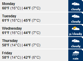
- Descriptions are overly simplistic.
- Like the simple graphics.
- Unless it was done for reasons of space, it seems easier to read extended forecasts from left to right rather than top to bottom.
8. Google

- Attractive, colorful graphics.
- Lack of a description means that you have to guess what the designers intended the graphics to mean.
- The ‘cloudy’ graphics seem to get darker on the right – does this mean that rain will come later in the day (e.g. morning sun followed by afternoon showers)?
9. King5 (Local TV station)
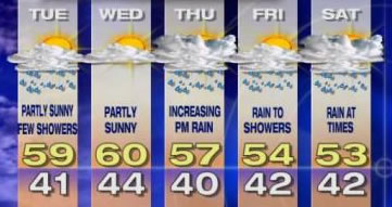
- Overly elaborate graphics – basically they just took a screencap from the TV and threw it on the web.
10. Kiro TV (Local TV station)
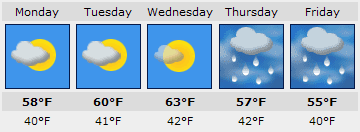
- Again shows that graphics do not really work without descriptions – are Mon & Tue partly or mostly cloudy?
- Graphics for Thu and Fri look they’re forecasting a combination of fog and snow!
11. MSN
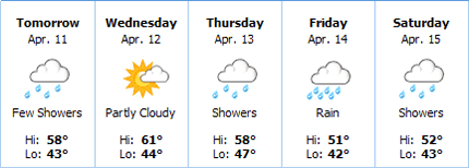
- Clean, simple layout.
- Could do with more variation in graphics – ‘few showers’ is the same as ‘showers’.
12. NWSource

- Why the teeny, tiny graphics?
- No need to spell out ‘high’ and ‘low’.
- Overall layout could be better – more whitespace needed.
13. New York Times

- Very ugly graphics.
- Too much information for such a small space.
- Why not abbreviate ‘low’ as well as ‘high’?
- Why use Times New Roman for the font at this size – it doesn’t scale well at all.
- The description is separated from the graphic, making them harder to associate.
14. Seattle.gov
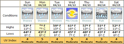
- Very comprehensive information, although given this intent, I wonder why they left out wind speed.
- Clear, colorful graphics.
- Shame about the ugly table borders.
- Not sure that including temps in °C was necessary – who is that information for?
15. Seattle PI Newspaper

- Good overall.
- Graphics are a bit dark and ‘grungy’.
- Good descriptions.
16. Seattle Times Newspaper
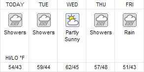
- Descriptions are rather short.
- Graphics are okay although the same one is used for ‘showers’ and ‘rain’.
- No need to include the ‘HI/LO deg;F’ legend – I think people get it.
- Why all the white space under the descriptions?
17. Weather.com
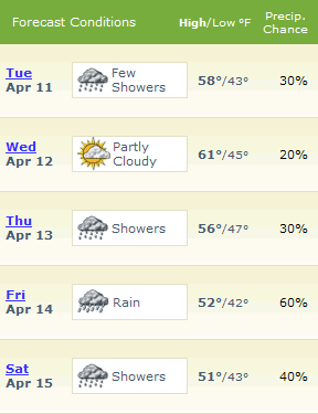
- Nicely laid out and easy to read.
- Clear graphics – the only site to use a different graphic for ‘rain’ and ‘showers’.
- Descriptions could be longer.
- Useful to include chance of precipitation.
- Putting the ‘high’ temp in bold helps it to stand out as the important number.
18. Weather Network
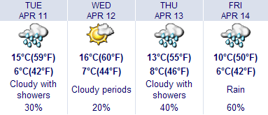
- Graphics are a little too cutesy and lack variety.
- Surprising that for an American audience they put °C as the main temp (I’d love to know the reasoning behind that).
19. Weather Underground

- Ugly, overly cutesy graphics.
- What’s with the big ‘?’ covering some of the images. I suppose it’s to indicate that there’s a chance of rain, but how is it helpful?
- Good to include a link for each day to a detailed forecast.
20. Yahoo!

- Looks like they share their graphics with AOL and CitySearch.
- Not sure that it’s better to use a relative date like ‘tomorrow’ than just to put the actual day. Why try and be clever?
- Large, clear temperature numbers.
Parting Thoughts About Weather Forecast Graphic Design
So that’s my take on weather forecast infographics, with my favorite (surprisingly) being Bloglines. What’s yours – I’d love to know which ones you prefer and why.
Also, are there other sites with better or different approaches to weather forecast infographics? For example, 6 Weather in Lawrence, Kansas has a very novel approach.
If you have any others from around the country or globe, please share them here!
nice comparison … though you mentioned more than once that certain infographics were the only ones to use a different icon for rain and showers … i saw like 5 of them that used different graphics.
it seems like all of these could be done better!
My favorite graphics are the ones shown in …say…southern Greece … where there is nary a raindrop in sight this time of year!! I admire your will and stamina to bicycle in this weather! Mine is still at Greg’s at Greenlake waiting for me to pick it up! Maybe this fair weather rider will get out there by August!
Interesting post! I’m on the World Online team, responsible for the 6 Weather site you linked (thanks for that!). I thought I’d point out one of our newer sites, which I think has some great weather illustrations…
http://www.49abcnews.com/weather/
The illustrations were done by our Dan Cox, and I am responsible for the CSS work and layout of the 6 Day Forecast table. 🙂
Thanks again.
*Loreley* – maybe I’ll see you on the Burke-Gilman some day! I’ll be sure to wave as I whizz by…
*Jeff* – I thought I remembered your having a hand in the 6 Weather site.
Thanks for the example from your new site – I like the illustrations, but I do wonder why you chose to put the descriptions at the bottom, below the temperature numbers.
Personally, I like the descriptions to be right below the graphics – but that’s just the opinion of one!
Here’s a few more from around the globe:
* “BBC”:www.bbc.co.uk/weather/5day.shtml
* “Der Spiegel”:wetter.spiegel.de/spiegel/ (click into the map a couple of times to see the ‘cute’ weather animations)
* “Le Monde”:www.lemonde.fr/web/meteo/0,31-0,42-355,0.html
Interesting comparison. Have you looked at the BBC Weather site? Very nice, plain, cleand and crisp graphics.
Damn, I really should read these comments properly before I post!
How come you always see things like BBC just after you press the Submit button! 🙂
Glad to know I’m not the only one who thinks Weather Underground’s icons are wicked ugly!