I love these delightful add-to-cart animations! They make me want to keep adding items to my cart over and over.
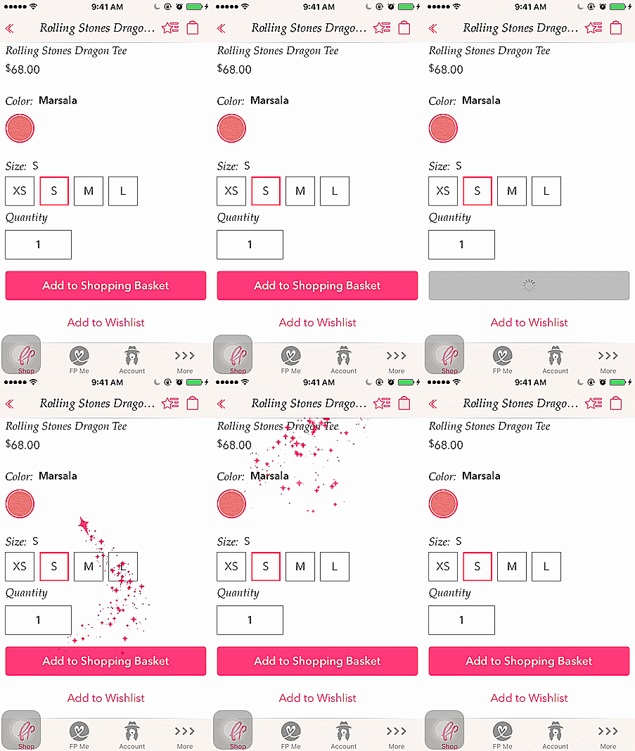
The first one is from Free People. The whimsical style is very appropriate for their brand.
The next one is from Zappos:
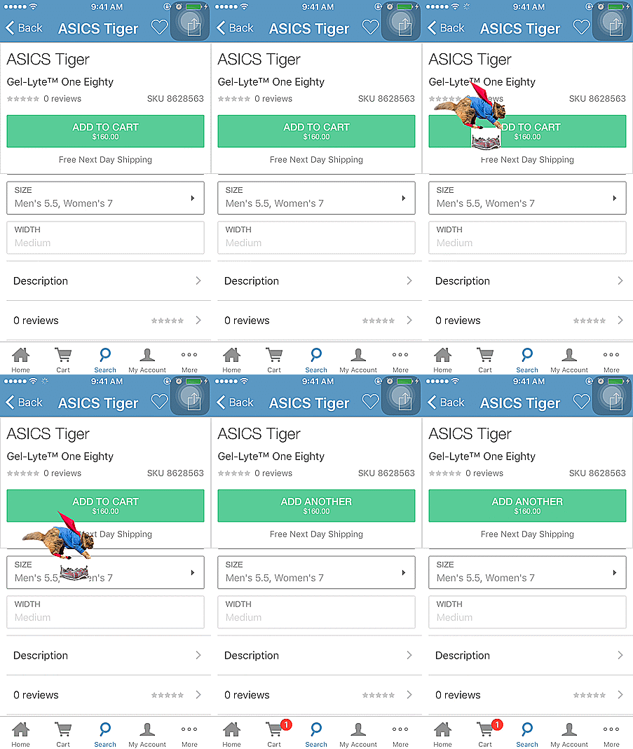
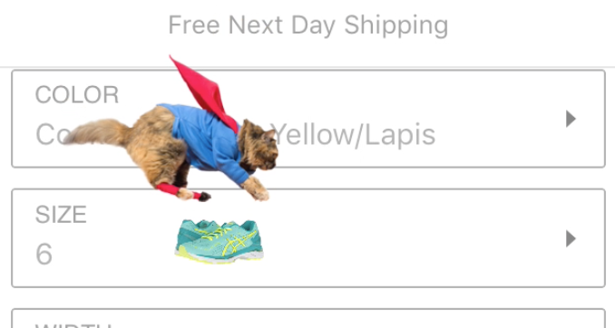
This one gave me more of a ‘what the heck?!’ reaction, but it’s very fun nonetheless. Here’s a snapshot of ‘supercat’ in action:
The next example is from Lilly Pulitzer:
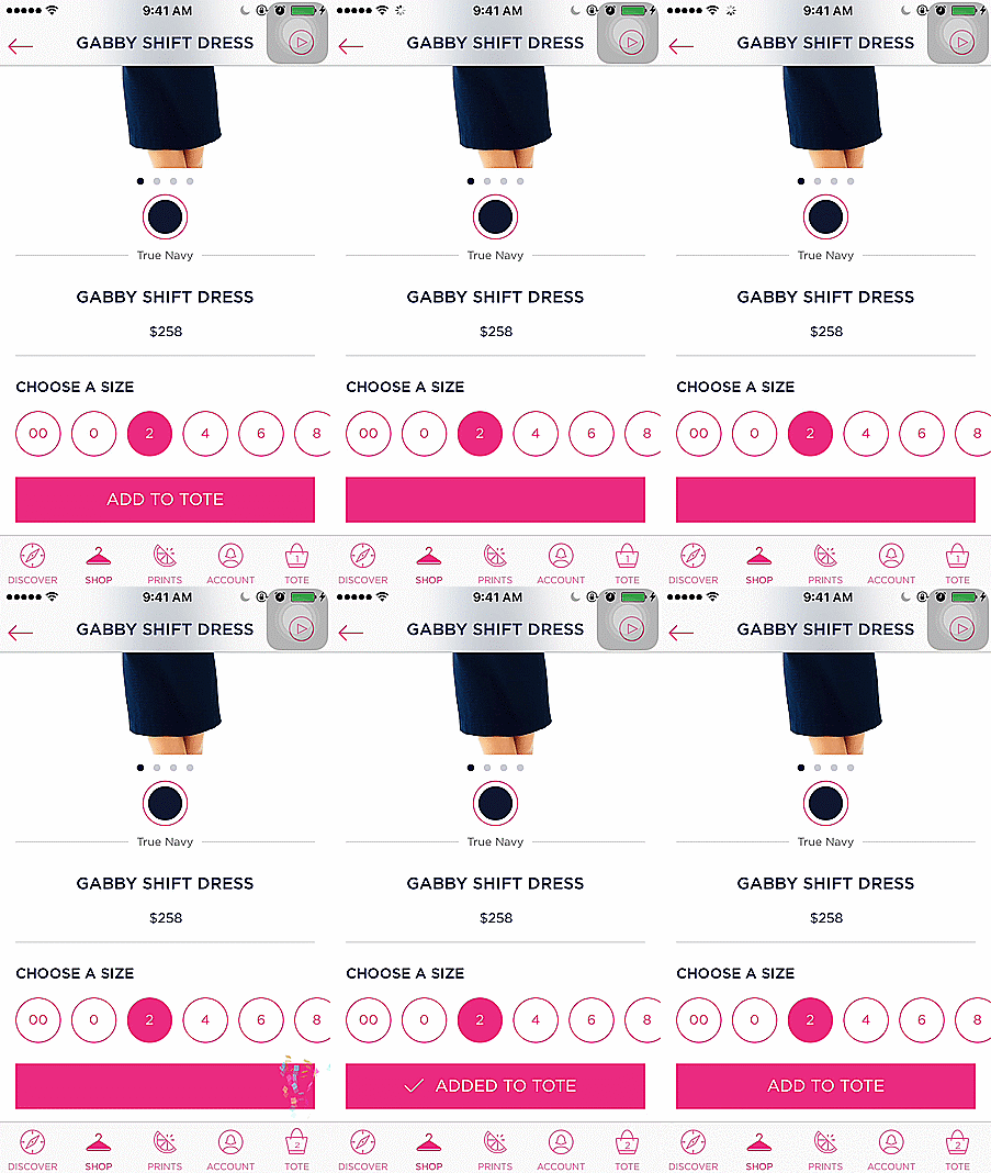
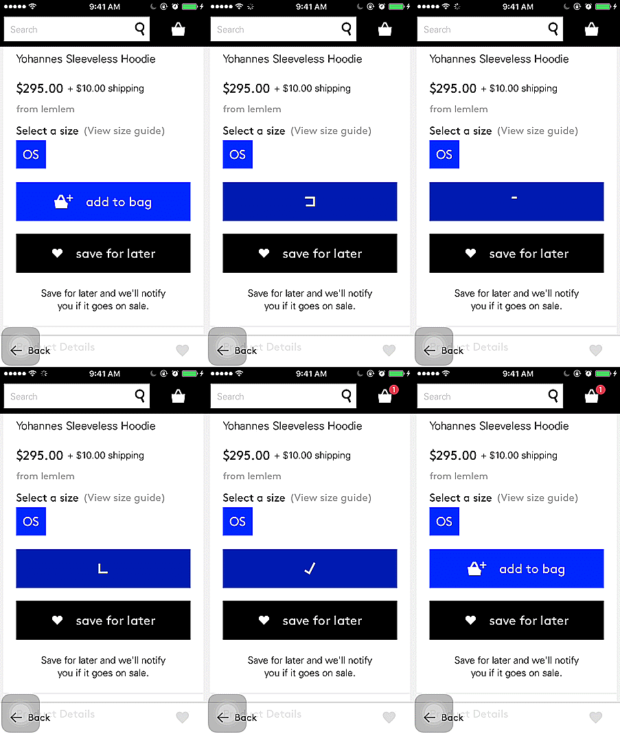
This example from Lyst is a little more subtle, but shows how much impact you can have just by animating the add-to-cart button:
These examples of micro-interactions show how small design details can make a product more fun and interesting to use.
The difference between a product you love and a product you tolerate is often the micro-interactions you have with it.
~ Dan Saffer, microinteractions.com

interesting supercat style – it’s kind of funny.