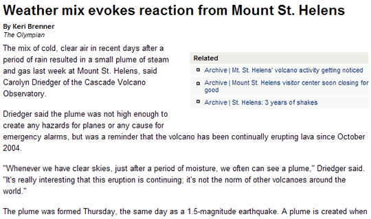
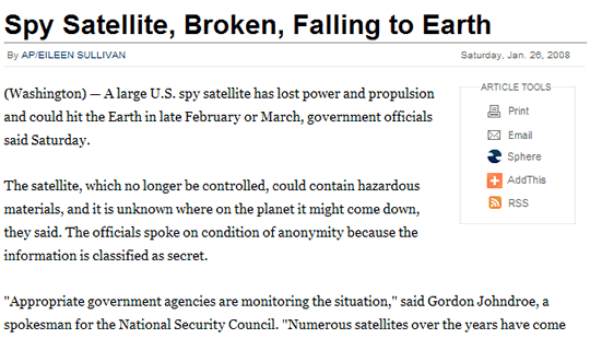
There’s something special about opening a page that uses great typography and layout. The headline pops out at you, drawing you in. Through good use of spacing the text looks readable and inviting.
The paragraphs are nicely chunked so you know you can read through them without losing your place. Images are given room to coexist on the page, and the caption text doesn’t blend in with the rest of the copy.
All these elements combine into a feeling of acknowledgment of the reader by the designer — a recognition that for content to be truly read it has to breathe, unencumbered by short line heights, narrow columns, small font sizes and intrusive advertising.
Given that most of the internet is still content-based, why is it then that there are so few really good examples of what I’ve just described above, especially on large, commercial, content-rich web sites? You know, like news and magazine sites?
Below are some examples — not necessarily perfect — of sites that get it.
They understand that to be effective, content has to be read, and to be read it has to be presented in a way that acknowledges and rises above the limitations of the medium in which it exists.
1. Business Week

2. Financial Post

3. The BBC

4. The New York Times

5. The Seattle Times

6. TIME Magazine

As I mentioned, these examples are not perfect. Business Week’s paragraphs are a little too long. The BBC’s style is a little too functional (although very readable). I’m personally not a huge fan of The Seattle Times’ choice of Arial as a body copy font.
However, they do get most of it right — oh, and these screenshots do not do them justice.
I’m sure I’ve missed some great examples of well-implemented web typography on large, commercial web sites. Please let me know in the comments.