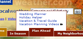
I’m a regular user of the Weather Channel’s web site. However, other than plugging in my zip code and checking out the current and extended forecast, I’ve never really looked at the rest of the site.
For some reason the main navigation bar caught my eye the other day.
As I hovered my mouse over it I was surprised to discover that the site uses fly out menus that ‘drop up’ (for want of a better term) rather than drop down.

As far as I can recall, this is the first time I’ve come across a site with fly out menus that work in this way.
I’m surprised that a heavily trafficked site like this would break such a ‘universal’ navigation convention, especially as I can find no obvious reason for doing so.
In fact, there seem to be a couple of negatives to this approach:
1. The navigation breaks on text resize.
If you increase your browser’s text size by 1x the bottom options on the fly out menus become hidden by the main nav bar.
And you only have to increase your text size 2x for the top navigation option to disappear off the top of the screen.
2. It’s not clear which are the most popular/important menu options.
When you assemble a navigation menu there is usually a hierarchy of choices.
Typically, the more popular menu options are placed at the top of the list where they are more prominent and are closer to the parent navigation bar.
However, in this case, because the the fly out navigation works in reverse, does this mean that the most commonly used options will now be at the bottom of the list (so that they are closest to the main nav) or should they still be at the top?
Given these downsides and no clear benefits over using regular drop-down menus, I’d love to know the reasoning behind this unusual navigation choice.
I guess the reasoning behind it was that they didn’t want the navigation to drop down and cover the main content of the site; which to be fair is an issue I have with some types of drop down navigation.
Through this they have also limited themselves on how many options they can have on a menu before it goes off the top of the screen.
All in all very silly.
Matthew – that may well be true.
However, once someone has decided to click on the navigation they are no longer interested in reading the content on your page.
You’ve basically lost them at that point.