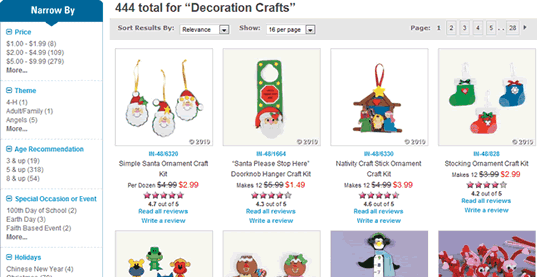
Although they are an important component of many websites and almost all online stores, very little appears to have been written about designing great category (also known as ‘gallery’) pages.
This is despite the fact the Jared Spool calls them the hardest working pages on your site given the key role they play in directing users to the correct end content.

A well designed gallery page can be critical in reducing e-commerce site abandonment by preventing users from ‘pogo sticking’ back and forth from category page to product page in a vain search for the item they are looking for.
On large e-commerce websites in particular, gallery pages must present key information about a wide range of items in an easily scannable format so that users can make an informed decision to click through.
They also need to enable users to reduce the number of options presented through product filters (which could be features, review scores, price, brand, etc).
And we shouldn’t forget that gallery pages need to present their products well through appealing imagery – not an easy task given the amount of space product images usually have on these types of pages.
Given the combination of content and functionality that gallery pages need to provide, it’s not surprising that they can be difficult to design well. Which is why I’ve gathered a collection of some of the better gallery pages – from both a design and functionality perspective – as a reference.
View the gallery page design showcase.
Your post is perfect timing 🙂 I’m currently looking for great category pages to build the perfect basis for our webshop solution.
Thanks for a great blog and happy New Year!
Thank you for this post, as well.
I have been creating content for a website design company and found these category pages to be the more challenging pages to work on. Organization is ESSENTIAL since content is limited. In order for these pages to be successful, the user must be able to navigate quickly and efficiently.
Please feel free to visit my company website:
http://www.whitemedia.com
Thank you!
Glad this post was helpful! I pulled it together myself because I needed some reference sites to review with my team.
The headache of “organisation” for these category pages is most certainly the hardest part of designing the e-commerce site! Takes much planning and I find a good “sketched sitemap”. Nevertheless we must remember that this is the first page that the visitor views of a category and therefore we should ‘prioriitise’ this aspect of the design.
Very interesting blog.Lots of thanks for sharing.I’m currently looking for great category pages to build the perfect basis for our webshop solution.
i was searching for some most value able pages which can help me in excellent show case design…so i found this page n its really been helpfull for me,,,
Product category pages that include text underneath and a rating system with links to reviews are the best.
Great article and a very complete gallery. I believe that design a product page can be extremely difficult, it could make or break an entire online store.
In my opinion cleanliness and usability are key: if you make people work to hard to get the purchase done, they will be gone and will never return and that can be seen on the examples: made to make a purchase easy and still have a little class.
Clear design and a simple navigation is the key for success on a category page!!! Thanks for this post we will keep on remembering this in our future ecommerce projects.
An interesting article to read. A gallery page can definitely be difficult to design when trying to balance the combination of content and functionality. The collection of gallery pages you have found are great. I have book marked these as reference for my next product category page I produce.
Thanks for sharing.
A gallery-page are so hard, cause if you make too small thumb-nails then people can’t see what’s on the images. If you make them too big, then it gets annoying. Good blog – I like it.
very interesting …thank you
really useful content
thankyou for sharing!!!
Perfectly designed and well arranged gallery pages.
These are really beautiful and inspiring
Thankyou for sharing!!! i will surely consider it as an inspiration in my web design career
Very interesting blog here. Thanks for sharing though. Certainly very useful and handy.
I’m just starting out on a couple of new e-commerce projects and this article has been really helpful, thanks for sharing.