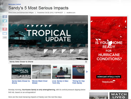
I came across this banner ad on Weather.com today from Travelers Insurance. Given that millions of people are likely to be pretty miserable over the next few days to weeks, I’m trying to decide if it is being responsive to the news of the day or is just in bad taste.

I’m on the fence — what do others think?
It’s not that bad. Think about it from the kaleidoscope lens that many people do not have such coverage. Yes, those affected by Sandy will rebuild; however, some will more than likely seek additional coverage to include Hurricane disasters. What I don’t like about the ad, is the background color. Teal blue would better convey the sense of being a protector vs red that implies dynamic & energizing. Your thoughts?
Rotating banner advertising based on keywords from the page. …wow… Considering the main KW for that page, the ad makes sense. definitely brings attention to it – but honestly, kinda late for people to be buying insurance. I see similar advertising on many news channels (eg. flood insurance ads when there were tsunami warnings in Hawaii – but browsing from Colorado).
Now wouldn’t it be neat to have geo-tagging along with the rotating ad banners?
Wow, they’re really overdid it with the giant red banner. If it weren’t red, it might look like part of the content on the website, which might yield better clickthroughs. I’d be interested to know how a more neutral ad would perform compared with the bright red one.