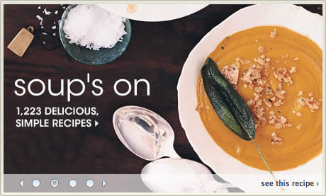
The home page is some of the most valuable real estate on a web site. For many web sites it is still the primary point of entry for the majority of visitors. Consequently, web site owners want to cram as much enticing content on to the home page in order to attract visitors into the site.
Because of this, the carousel has become a very popular way to showcase multiple pieces of featured content within a fixed promotional area.

I thought it would be interesting to showcase a variety of home page carousel designs to see what common themes emerged and also what different approaches designers took.
I have done absolutely no usability testing on carousels so I won’t comment on the pros and cons of the different approaches taken, such as whether to present items horizontally or vertically, to include playback controls, and the ideal amount of content to feature for each item.

However, it was interesting to note that although the number of items being featured largely varied from three to five, five is clearly the most popular number of items to feature.
I don’t know why that should be the case — six or seven doesn’t sound like too many to me. Maybe it has just become a convention over time as designers look at what other designers have done and follow suit.
Further Reading on Image Carousels
- Yahoo’s carousel design pattern library
- Image carousel click-through analysis
- Why you shouldn’t use image carousels on your website