Several people have kindly pointed out that in my previous post I did not review the official Utah tourism site.
That’s right. The web site of the Utah Office of Tourism is not the official site of the Utah Office of Tourism. Confused? Well, it turns out that Utah has not one, not two, but three tourism sites.
Will the Official Tourism Site Please Stand Up
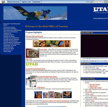
There’s the site for the Utah Office of Tourism, which I linked to in my post:

Then there’s Utah.travel which is the “Official Site of the Utah Office of Tourism”.
However, it’s just a glossy front-end / home page for yet another site as the links on it actually take you to Utah.com.

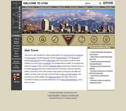
So, it would seem that the real official tourism site is actually Utah.com, although it doesn’t bill itself as such.
Yes, it looks official, but how can you be sure. After all, in the footer it says “© Utah.com” — no mention of the Office of Tourism.

That being said, Utah.com and Utah.travel are clearly much better designed than the Office of Tourism site I originally linked to and are far more in line with what I expected from a state tourism web site.
In fact, Utah.travel looks pretty great, although I don’t see why it had to be completely done in Flash (nor why it has to have ‘mystery meat’ navigation — I challenge you to guess where all the main navigation icons will take you without mousing over them).
The Problem
So, yes, I reviewed the wrong site. However, if you look at how I arrived at the Office of Tourism site, I wonder how many other people are also visiting this web site ‘by mistake’ as I did.
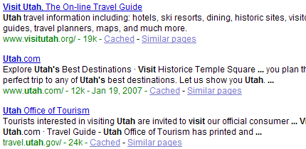
When I was researching my post I started all my site visits by typing “visit [state name]” into Google. Here’s a snapshot of the first three results for “visit utah”:

The first result, Visit Utah, looked pretty promising, especially with that “.org” extension. However, once I arrived at the site I could quickly tell that it was not the official tourism site and was most likely a commercial site of some sort.
For starters, there was no mention of the Utah Department of Tourism on it (not even in the footer), which is the sure-fire way to tell if you are on the official state tourism site or not.
The next result, “Utah.com”, looked like it would be a commercial site, especially with that “.com” extension. Also, the description had a typo — Visit Historice [sic] Temple Square — which didn’t inspire confidence.
Of course, this is the actual official Utah tourism site; however, as I could already see the third result below it, I skipped it completely.
The third result looked like it must be the right site. After all, it mentioned the Utah Office of Tourism in both the search result heading and the description. How much more ‘information scent’ do you need?
Consequently, that’s where I clicked. Once I arrived at the site, there was nothing to dissuade me from thinking that I was on the official tourism web site. “Welcome to the Utah Office of Tourism” is a pretty big hint.
On revisiting the Office of Tourism site I can see that there is a link at the top of the body copy to Utah.travel called “Plan your Utah vacation now”, so I would imagine that many people do get redirected to the correct web site.
But I would imagine that many don’t.
From my experience of watching users completely miss (seemingly) obvious links on my own sites, I would imagine that plenty of people click elsewhere on the site and end up lost.
After all, there are some very tempting links in the left hand navigation for someone planning a vacation to Utah:
- Tourism database
- Utah scenic byways
- Utah destinations
- Research & planning
- Images of Utah
Click on any of these and your chances of finding your way to the official tourism site rapidly start to dwindle.
A Solution
It’s hard to deny that there’s a pretty confusing user-experience going on here. Fortunately it’s not too hard to fix it.
Here’s what I would do:
- Add a meaningful page title and meta description (preferably typo-free) to Utah.com saying that this is the official site of the Utah office of tourism. I mean, really.
- Fix the footer on Utah.com by adding something about this being the official web site of the Utah Office of Tourism.
- On the Office of Tourism site add a link in really big text to the official tourism site. Something like “STOP! Click here if you are a tourist”, although without the “click here” part.
- Move the site that resides under Utah.com to Utah.org and make Utah.com redirect to it. If I’m looking for a government site I don’t expect it to have a “.com” extension. Currently, Utah.org redirects to Utah.gov so that shouldn’t be a problem.
- Get rid of Utah.travel. I don’t honestly see the point of it except to add confusion to visitors. How many sites even use the “.travel” extension? I’ve never been on one. It’s never going to show up in Google.
- Port the nice design from Utah.travel over to Utah.com, which is looking rather pedestrian by today’s standards, and just have the Utah.travel URL redirect to Utah.com (or, rather, Utah.org — see #4, above).
Parting Thoughts
These are just one person’s opinions. Agree or disagree? What would you do differently and why? I’d love to know.
Considering that all of “The Best” websites use the .com domain (except Utah obviously) and 36 of all 50 were .com, step four doesn’t make a lot of sense.
Steps one and what was said after five, (we’ll call it six) are most important.
p.s. You meant to say “(or, rather, Utah.org — see #4, above)”
*jb* — good point about the use of “.com”.
However, I would argue that it is not a good idea for any of these sites to use this extension.
I think it reduces their credibility and makes it harder for the visitor to be sure that they are not on a commercial travel site. I don’t see any reason for the “.com” URL to simply redirect to the “.org” or “.gov” URL.
I’m constantly surprised by the number of (mainstream) folks who don’t think twice about the extension.