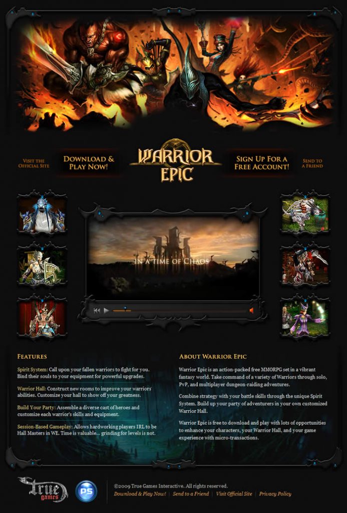
Like many online games, Warrior Epic has a landing page to which we direct traffic from our web marketing campaigns. Luckily for us, our first landing page actually turned out to have a surprisingly good conversion rate.
Using Google’s website optimizer, we recently tried out a couple of new landing pages to see if we could improve upon it.
I’ve been pretty happy with our initial landing page. Although it’s quite long, it showcases the game well and I feel does a good job of selling it to a new visitor.

Like I said, we were getting conversion rates above what is usual for banner traffic so I didn’t feel a strong need to do a lot of tweaking.
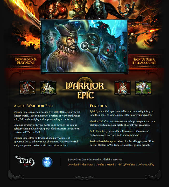
However, marketing wanted to try out some new concepts and so we tested out version 2 which was a variation of the original landing page.

The goal of the second landing page was to brighten the page up a little, move more content up above the fold, and remove any non-conversion-related links from the main content area.
I thought we achieved this pretty well; however, the landing page performed very slightly worse than the original.
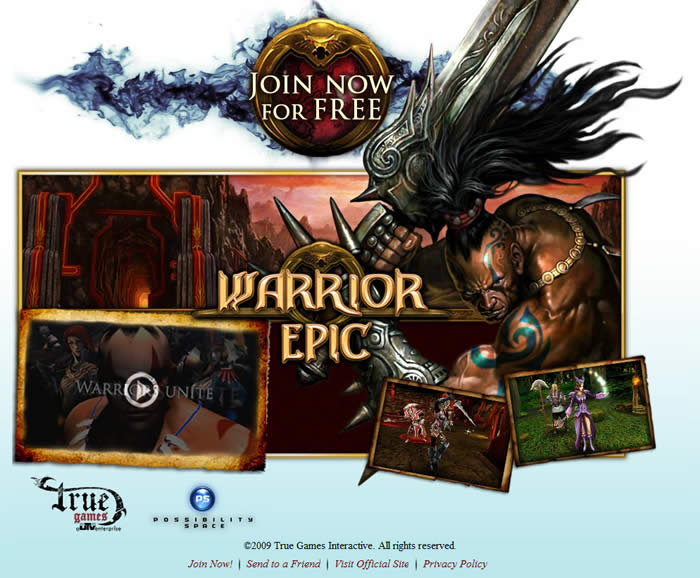
The third landing page featured a completely new design.

I’ll be honest; I wasn’t a fan of this design at all. The white background felt too stark to me and it removed the content which highlighted the key features of the game.
The great thing about using an A/B testing tool to optimize your designs is that you get a definitive answer as to which works better. The only thing you have to invest is the time spent developing the variations.
It took less than a day of A/B testing against the original design to show that this new version dramatically outperformed it. It’s a good job I didn’t listen to myself.
We plan to run a few more variants of the winning design to see if changing the call-to-action wording has much of an effect.
We also have a version in the works which has the account sign up form embedded in it. I’m really keen to see how that performs, as I simply have no idea.