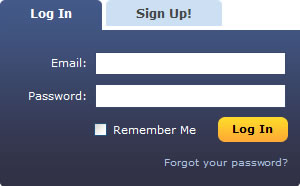
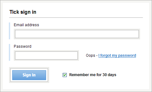
After putting together a registration form design showcase, the logical next step was to do the same for login forms.

65+ examples later, it’s been interesting to see the creative approaches that some designers have taken to this most basic but important element of a web site.
It’s also been interesting to see what conventions stand out regarding the design of login forms.

For example, should it be login, log in or sign in? How should the forgot password link be written? What about including a cancel button? Should it be keep me signed in or remember me on this computer? Should the layout be horizontal or vertical?
I did notice that few sites laid their login forms out horizontally in order to fit into the masthead and enable users to log in from the home page or any other page.

It seems that most web designers are happy to ask users to click on a link to get to the login form. This doesn’t seem unreasonable to me, especially if it is combined with a ‘remember me’ cookie to keep you logged in for future visits.
If you’re not sure how best to lay out your login form or what conventions to follow regarding labeling, then take a look through the showcase – hopefully you’ll get some idea of what best practice looks like.