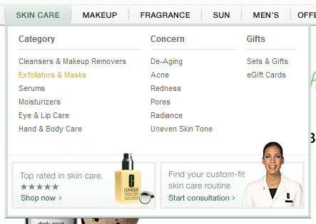
With the ever increasing use of ‘mega-menus’ it’s useful to see an article like the recent one from Jacob Nielsen reminding us that there are still design pitfalls to be overcome in implementing them effectively.
The key point I took away from his post is that mega-menus are a design canvas — they can just as easily reduce the usability of navigation as enhance it.
If you choose to use a mega-menu on your website, you need to organize your navigation in a way that is appropriate for this format.
For more examples of mega-menu design, check out my mega-menu collection over at Elements of Design.

I have always hated “mega-menus” but in some aspects like you have lined out they are a fairly ‘good’ option. thanks for the collection.
Great Article…Keep posting!
I am very happy that I found this posting! I enjoyed it very much! Thank you for sharing with us!
Useful post i clear my doubt in this post thankx
High Content websites with a lot of categories and sub categories can definitely find the “mega-menu” useful. I have found that it is actually harder to convince a client to use them, because they are still new.
Recently, I suggested a menu that would have increased the usability of an insurance company website, but they balked at it. The marketing team liked the idea of a vertical menu, only.
Mega-Menus are great and can really help a site’s usability, but the site has to be ripe for the menu as well.
im a fan of mega menus. as with anything online, the design the behind a mega menu will dictate whether it’s usable or not. Some sites are really bad and will probably have really bad menus too…
Good Article
get great hel from this artical.
i add the mega menu on the site which enhance the usability of the website. i found a site Photoshop Print Templates here you download free photoshop template visit this site must.
Mega menus can still be great, especially if there are tons of clickable links and spots as parts of the websites navigation, the example of shops can be cool in this respect.
For the smaller profiles and blogs, using simpler structures could be nice.
There is definitely a degree of contradiction with mega menus. While various navigation options exist for the user, it can often be overwhelming and, therefore, confusing to use.
I was actually reading another blog recently which discussed the beauty of simplicity within logo design, website design, and the like. It was very interesting and I found myself in agreement with most of it.
I work at a website design company in New York and I invite you to check us out- http://www.whitemedia.com
Thank you for this post. Very interesting!
Yep mega menus have pluses and pitfalls. I’ve enjoyed using JQuery to sort out some of the design aspects of this. I think that there are plenty examples of badly designed mega menus, but the best ones work seamlessly and don’t hinder the user experience.
I have selected the same method.. big menu..