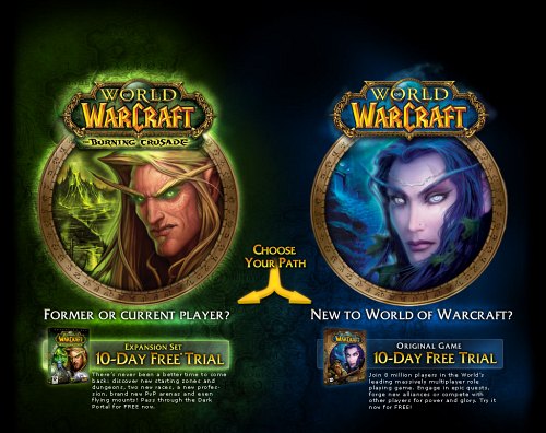
A free trial has become something of a pre-requisite for a subscription-based MMORPG (massively multiplayer online role playing game). In fact, of the major MMOs only Age of Conan does not offer a free trial.
With so much competition for players to choose from it is critical that MMO free trial landing pages are effective at communicating their value proposition and answering potential questions in order to convert visitors into trial accounts.
Let’s look a little further into the key elements of a successful MMO free trial landing page.
Clear, focused design
Good landing pages are focused on one thing: converting traffic. To that end, the best ones are usually designed as a self-contained web site and are not presented within the confines of the main game web site.
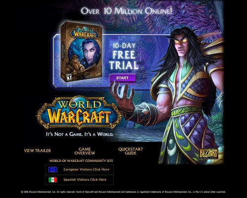
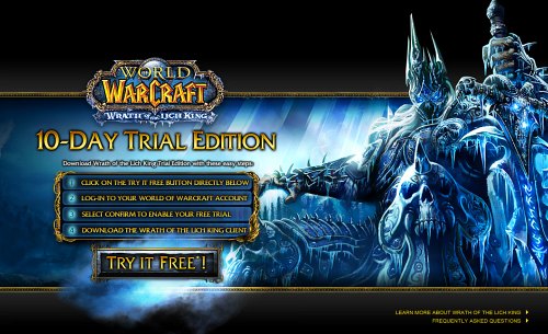
This enables the design of the page to be completely focused on the task of converting traffic. Guild Wars and the World of Warcraft landing pages are good examples of this concept in action.
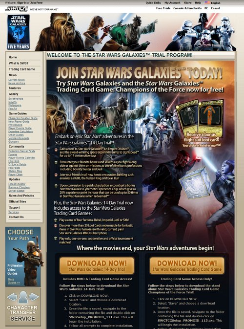
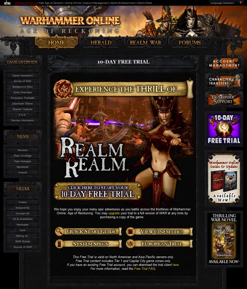
Warhammer Online and Star Wars Galaxies fare less well because the landing pages have to compete with the ‘noise’ of the rest of the site. Look at all those links for potential customers to click rather than the one that converts the visitor.
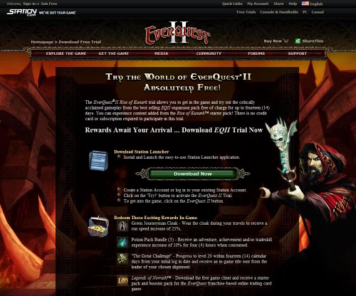
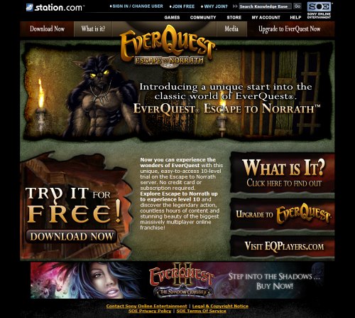
Other pages fail due to too much reliance on large amounts of text (EverQuest II) and competing calls-to-action (EverQuest).
Compelling message
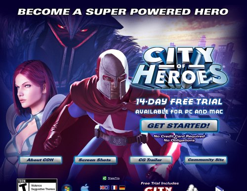
The better landing pages have a strong headline which sums up the appeal of the game and doubles as a call-to-action. City of Heroes nails it with:
Become a Super Powered Hero
Although poorly presented, Warhammer Online’s “Experience the thrill of realm vs realm” powerfully sums up one of the key selling points of the game.
War of Warcraft makes the most of their main strongpoint, their huge player-base:
Over 10 Million Online!
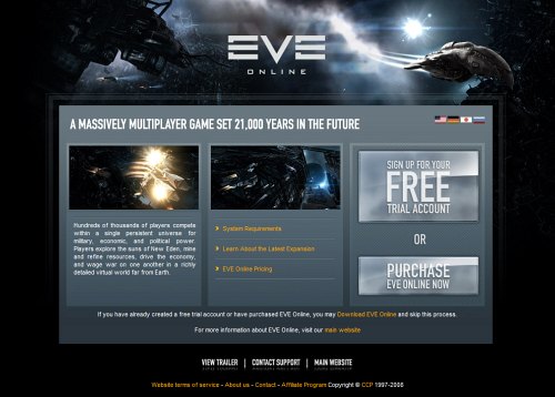
Eve Online gets part of the way there with:
A massively multiplayer game set 21,000 years in the future
How about something more dynamic like:
21,000 years in the future, rival corporations fight for control of the galaxy
Star Wars Galaxies fails completely with a long winded:
Join Star Wars Galaxies today! Try Star Wars Galaxies and the Star Wars Galaxies Trading Card Game: Champions of the Force now for free!
In 24 words not one reason has been provided as to why someone should try this game.
EverQuest actually has a compelling selling point for its free trial which it fluffs completely because of poor messaging. Its trial is level-based rather than time-based, meaning that you can enjoy it at your own pace.
However, this important differentiator is only pointed out in the ‘small print.’ How much more powerful would it be to say something like:
Discover EverQuest at your own pace. Play for free until level 10.
rather than
Introducing a unique start into the classic world of EverQuest.
Strong imagery
A key component of an engaging design is having strong imagery that supports the key messaging and represents the essence of the game. This imagery should ideally be bold and specific – it should represent the game rather than the genre.
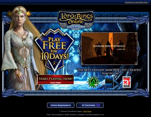
Compare the character in the Guild Wars page who is almost reaching out through the screen at you to the flat and generic character in Lord of the Rings. Which one makes the bigger impact?
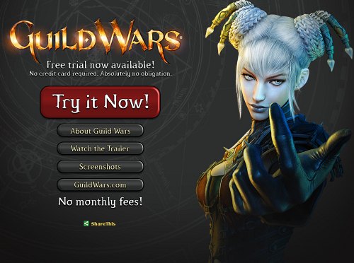
Looking through the examples below, most free trial pages do a poor job in this respect, either minimizing the imagery so that it has little impact or using such standard genre imagery that it undermines the messaging on the page.
Answer key questions
Important questions for any MMO free trial are “How long will it last?” and “Do I have to give you my credit card?”
City of Heroes and Guild Wars deal squarely with the second question by stating that the no credit card is required and that there are ‘no obligations.’
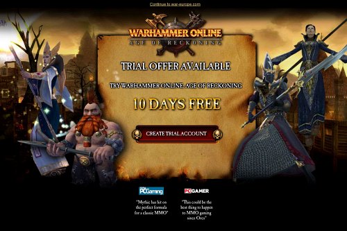
Most of the other MMOs either make no mention of this point or place it in the small print.
With regard to the first question, for some reason Guild Wars is the only trial that does not state how long it lasts. Most of the other trials are for 10 days so those that offer a 14-day trial should present it as a selling point compared with their competitors.
Provide access to more information
Although free trial landing pages should feature a strong, focused design, it is useful to provide access to more information in case a visitor needs a little more selling before taking the next step.
Typically, this information is in the form of screenshots, videos, and an outline of the key features of the game.
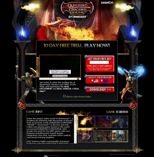
Dungeons and Dragons Online tries to present all this information on the page at once and makes it needlessly cluttered. Eve Online keeps you on the page by presenting additional information in a modal window.
City of Heroes and Guild Wars make additional information available further down the page on-click.
However, it may not be apparent to the user that they are still on the free trial page, so an additional ‘free trial’ button at the bottom of the page would be a helpful addition.
Clear call-to-action
The free trial button itself is an important component of the landing page. The wording that is used may be what causes an undecided visitor to actually take action and click. Therefore, the button label should be a clear call-to-action.
It is better to say something action-oriented like “Start Playing Now!” or “Get Started!” than a more generic “Download Now” or “Create Trial Account.” Believe me, there’s nothing exciting about downloading large files or creating accounts.
Here’s how the other free trial pages look:
Dungeons and Dragons Online
EverQuest
Lord of the Rings Online
Vanguard
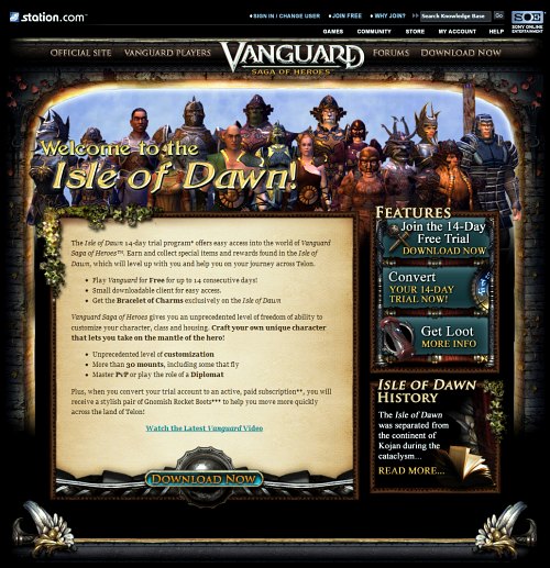
Warhammer Online
World of Warcraft: EU version
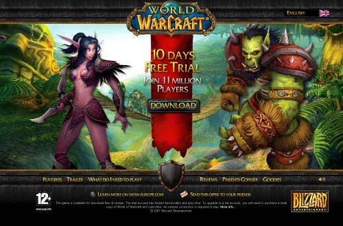
World of Warcraft: Burning Crusade
