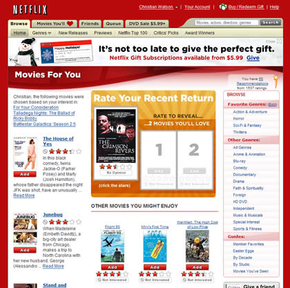
The best of 2006 lists are already starting to roll in, but I thought I’d keep mine simple this year and stick to one — my favorite site of all.
When thinking about the criteria for deciding my favorite site, I came up with two: what sites did I visit regularly during 2006 and (obviously) which ones did I most enjoy using.
Without a doubt, the winner is Netflix.

Why? In short, the site is a pure pleasure to use. It’s actually the main reason why I’m reluctant to consider switching to rival Blockbuster, even though they appear to offer a better rental deal.
However, the Blockbuster site (until its recent redesign — who knows what it’s like now) was a disaster.
The Netflix designers clearly love trying out new things to enhance the user experience. For example, the ‘info box’ that pops up when you hover your mouse over a movie was a great idea that has deservedly stuck around.
However, while there are many things you can do on Netflix’s site — from writing reviews, checking out your friends’ movie queues, to watching previews — these features and widgets don’t get in the way of your primary task which is to find and order movies. The site is extremely intuitive and easy to use.
One way I like to see how much attention to detail has gone into a web site is to check out its search function — an important but oft overlooked feature of any site.
Given the size of the Netflix movie database, search is surely a critical component of the site. Fortunately it works very well. Search results are even split into different categories (popular, movies, people and genre) for easy search result findability.
It’s a tribute to my enjoyment of using Netflix’s site that if I have a few minutes before I go to bed I’ll often go there and tinker with my queue and browse around for new movies. More often than not, before I know it, half an hour has gone by.
It’s a great site, I wish make one like that. Congrats for your blog, regards from Argentina!
yes man is saw the site i would like to tell that yes the site is made in a very nice way
the interface is nice and smooth with such a navigation that everyuone can understand in a glance and the content is placed will in the site which make the look and feel very interesting one.
*Benix* – you can learn a lot from the process Netflix follows to constantly improve its web site. Check out this UIE article on how Netflix uses “fast iterations”:http://www.uie.com/articles/fast_iterations/ in its development process.
Also this one from SvN talks about how Netflix “nails the customer experience”:http://www.37signals.com/svn/archives2/netflix_nails_it.php . Well worth a read.