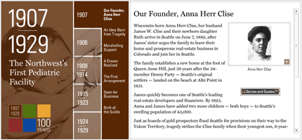
The place where I work, Seattle Children’s Hospital, is celebrating its 100th anniversary this year. To mark this occasion we created an online timeline of the major events in the hospital’s history.
Developing the timeline in the timeframe we had was extremely challenging and would not have been possible without some extremely hard work from my web team. I, for one, am very happy with the result.

That being said, I would be very interested to hear any feedback about it — you can never have too much constructive criticism.
Overall, I really like the design and especially like the stories & quotes feature. What I’m not completely sold on is your use of flash.
This isn’t because I have anything against flash, It’s just that I think you don’t gain anything from its use in this instance and that the entire experience would be more powerful if delivered as a traditional web page.
Your navigation and graphical impact are excellent, as is your content.
In my humble opinion, perhaps a more “historical” font could be used to match the 100 year history better. Just my $0.02
The best version of anything like this is probably the Wembley Stadium History time line.
The only problem I have with these time lines is that they open up in a new window. I also agree with the point about the typography by Dave BUT other than that, it looks nice..
All — thanks for the feedback!
Interesting point about the font choice, although I think that Miller, the one we use, works well across all the eras. I wonder if we could have used different fonts for different time periods; however, I think this would have been hard to pull off without looking clichéd.
As far as Flash is concerned, we were going to use a Flash/HTML hybrid. However, we ran into technical issues and with a time-crunch upon us it was easier to do everything in Flash.
One of those compromises you have to make sometimes when doing commercial projects.
hi everyone,
well, I don’t like….
1. I like to be warned, when I click, on a hyperlink, that a new window will open (accessiblity, utilisability…hum, ergonomy !).
2. I am still not conviced about the use of Flash for that context. But, yes, I know what users can make us do 😉
I am impressed overall with the work; for a restrictive deadline, it is a quality result.Most notable quirks:Rollovers: It’s disconcerting (IMHO) when I rollover a link and it seems to disappear, even if just for a split-second. I would have opted for a contrasting color for rollover effects. I prefer positive feedback in navigation, rather than fading into the background.
Copy: I looked it up to be sure—and though it’s not an entirely uncommon foible—the phrase is “In Memoriam” (vs. “In Memorium”) Notably, there were about five other high-profile sites that used the same misappropriation.
Also notable is where it didn’t appear; in a dictionary. (Merriam-Webster Online/Answers.com)In all concience, I would not be overly critical; your blog is often a beacon for my own endeavors in development. In all, I bet I wouldn’t have pulled off a site half as good in twice the time. (and I agree on marking off-site or new-window links, even if it’s “mystery meat” style iconography)
Well done.
*Doug* – thanks for the pointer re. the copy. I will convey your correction to our writing team. I can’t believe we missed that!
Good design.