Now that the iPhone has a true competitor in the Nexus One, I thought it would be interesting to see how their home pages compared. What is Google doing from an online standpoint to take on the smart phone market leader?
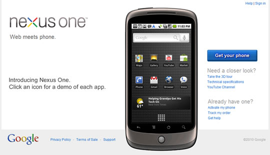
When I first viewed the Nexus One home page I was struck by how utilitarian it looked. The logo, the hero image of the phone, even the ‘buy now’ button — there is nothing compelling about what’s being presented. This really surprised me for such a major product launch.

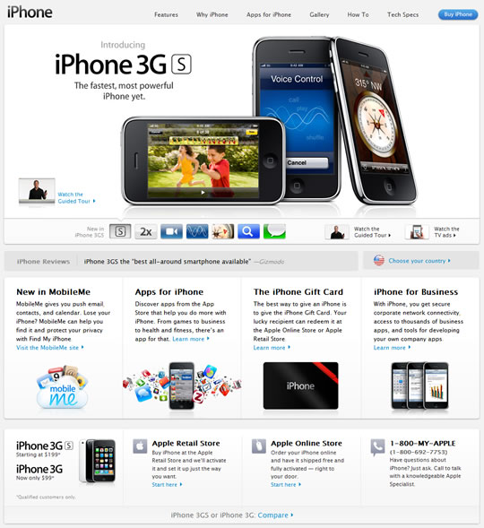
Compare this to the iPhone home page, which oozes quality. The logo is bold and elegant and the hero imagery shows off the iPhone’s excellent industrial design to great effect.
The autoplaying slideshow shows off the key features of the device without requiring any user interaction.
As soon as you arrive on the page, it starts telling you why you should buy an iPhone.

I think it’s fair to say that the Nexus One can’t compete on visual design, both in terms of the hardware and software (take a closer look at the phone’s home screen to see what I mean).
So, I was surprised that more emphasis was not placed on the features where it does stand out. Why exactly is this phone a worthy competitor to the iPhone?
It would benefit immensely from a more upfront presentation of what sets it apart from the iPhone. What exactly are its killer apps? Surely not Gmail and voicemail?
Apple uses the space below the main promo area to call out additional features and benefits, and Google would do well to do the same. Apple also enables the visitor to easily learn more about each feature.
I don’t know where I’d go to dive deeper into the features of the Nexus One.
The Nexus One’s interactive demo is good once you start using it; however, there’s no guarantee how many features a user will click on, and even if they will realize that the image of the phone is interactive (we know how people hate to read instructional text).
I couldn’t even tell that some parts of the phone were clickable without mousing over them.
Google should be much more proactive about what features the visitor should know about by displaying them automatically once the page loads.
Otherwise, without the benefit of great overall site design, the page appears very static and boring.
The page would also benefit from tightening the layout and a greater application of polish to the visuals. For example, the Nexus One logo and the tagline lack association due to the spacing between them, and the hover effect for the already lackluster ‘buy now’ button adds nothing.
The Nexus One page hammers home the importance of good copywriting. There is nothing remotely compelling about the content on the page.
“Web meets phone” is not a strong value proposition when compared with the iPhone. I think most people would agree that web has already met phone.
Compare “Click on an icon for a demo of each app” with “The fastest iPhone ever. Load web pages, launch apps, and more — even faster.” No contest.
Overall, the Nexus One site does a poor job of both launching and simply selling its product, especially when you consider the competitor it is going up against.
Which is a shame, because I’ve heard it’s a pretty decent smart phone. You’ll just have to find that out from another website.