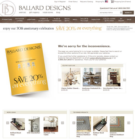
This 404 error page best practice from online store Ballard Designs, seems so obvious I’m surprised I’ve never seen it mentioned before. In addition to providing your visitor with the usual links to home, search, customer service, etc, why not provide them with actual product recommendations?

Product recommendations on Ballard Designs 404 error page (click to view larger)
According to Which Test Won, when A/B tested against a version of the 404 page with no product recommendations:
Version B, the 404 page with purchase options, increased total purchases, new customer purchases, add-to-cart rate, and average page views.
I’m certainly going to work with my product recommendation service, Barilliance, to add this feature to the sites I manage.
I’d also like to tweak it so that visitors who arrive at a 404 page from a web search see recommended products that are customized based on the keyword phrase used.
This is such a great article. So many people that that if a page has a 404, they should just redirect it back home. Smart people will create a 404 page, but the smartest people will create a 404 like this that increases conversion!
Some good info here, thanks for sharing! Smart 404’s are something that everyone should be considering.