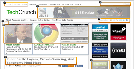
TechCrunch is the most recent recipient of a home page critique by Zurb, using Notable, their visual feedback tool for design teams.

Zurb have also reviewed the home page designs of other popular sites, such as Twitter and CNN.
While some of the feedback about the TechCrunch design feels somewhat subjective (view TechCrunch’s own post on the subject), I do agree with their feedback on the footer, that a different design would likely increase engagement.
In fact I posted my own redesign of the TechCrunch footer a while back. It will be interesting to see if something like this ever gets adopted.
Notable itself looks like it might be a useful tool if it is intuitive for non-technical people to use.
I know it is aimed at design teams, but I would find it really helpful for gathering feedback from other stakeholders (e.g. marketing) who are not always the best at giving their feedback in a clear and detailed manner.
I do like the options Notable provides to review code and copy as well as the visual design of the page.
That’s something you don’t see often. The history/tracking features of the tool look handy too. Fine, sign me up for the free version.