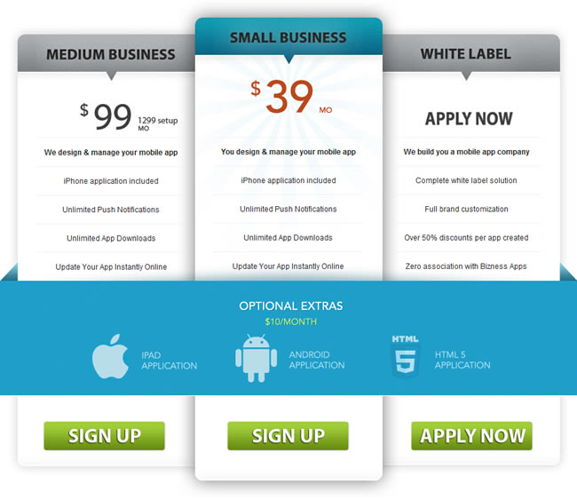
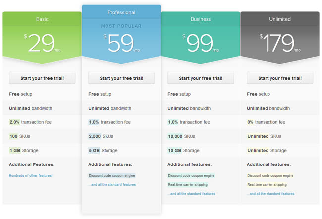
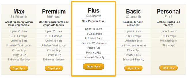
For my latest Elements of Design gallery I thought I’d showcase pricing tables.
Tables in general seem to be a challenge for the designer (take a look at CSS Table Gallery for numerous table design crimes against humanity), which must be why so many are functional but very plain to look at.

Pricing tables are a particular challenge because of the critical role they play in the sign-up process. They often have to convey a large amount of data and must do so in an easily understandable form.
In addition they must clearly differentiate between the features of various pricing plans and guide the user to pick the most appropriate plan.
Oh, and potentially answer any last minute questions and be aesthetically pleasing. Not an easy task and one which has significant bottom-line implications.
Once I’d gathered a reasonable collection, it was interesting to see what design patterns emerged from looking through the different pricing tables.

A check mark was the most popular method to indicate if a feature was available due to its ease of comprehension. This was particularly apparent compared with the Dabble DB pricing table which used “Yes/No” and was much slower to take in.
A dash ( — ) was the most popular method of indicating that a feature was unavailable. This makes sense as it doesn’t compete with the check mark but puts something in the table cell to indicate that it hadn’t simply been overlooked.
Some sites (e.g. Basecamp) took the extra step of indicating which plans were most popular or best for a particular audience. This is a good way to help guide the decision of the user to an appropriate choice of plan.

There was a fairly even split between putting the sign-up button at the top of the table — directly under the pricing information — or at the bottom, below the list of features.
It’s hard to say which is the better approach, but it would definitely be worth doing some split A/B testing to see whether the button position affects sign-ups.
Most sites used fairly generic terminology for their plans, such as:
- Free, Basic, Standard, Business
- Mini, Small, Pro
- Free, Basic, Plus, Premium
However, some sites were a little more creative with their naming:
- Time Machine, Starship, Private Jet, Limousine, Shuttle Bus, Moped
- Gratis, Ad hoc, Bona fide, Carpe diem, Ad infinitum
I would recommend against being overly creative with plan names as these terms are less likely to help the user quickly understand the level of the plan or to which audience the plan is directed.
Better to save the creative copy for the pages directing the user to the sign-up page.

There seemed to be a fairly even split between ordering pricing plans highest to lowest cost or lowest to highest. Again, it’s impossible to say which is the better approach, but this would be another thing to test.
Several of the sites provided help information for features in the form of tool tips. This seems like a good way to unobtrusively answer any last questions without forcing the user to leave the sign-up page.
Only one site — MediaMax — opted not to layout its pricing plans in columns and chose a horizontal approach.
It suffered in terms of comprehension due to the need to repeat content and the reduced scannability of the data. Clearly, vertical columns are the best way to present pricing plan information.