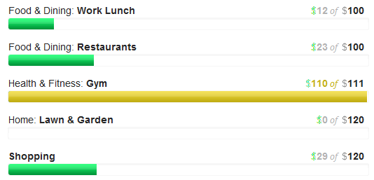
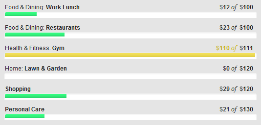
Not too long ago, Mint, a popular online service for managing your finances, redesigned a great feature which enables you to set a monthly budget and track your progress against it.
My wife, who is the main Mint user in our household has been struggling with it ever since.
One of the main issues is that the redesign of the budgeting page (for some reason they call it ‘Planning’ which makes no sense to me) is now much longer.
Consequently, it now requires much more scrolling up and down the page in order to get an complete picture of your current budget status.
A comment in the support forums echoes this view:
The budget section is nice but takes up too much space – make this smaller so that it is more usable and concise – the old view was much better.

However, with a few CSS tweaks, I was able to reduce the length of our budget screen by 20%.
In the example below, you can see that 6 budget items are now visible in the same space that could previously only fit 5.

I also took the opportunity to make some of the very light gray text darker in order to make it easier to read.
Mint is a great tool for managing your finances, but I do feel that they have a way to go on its usability in certain areas.