I’ve been a reader of TechCrunch for some time. Although I mainly read it via RSS, I occasionally visit the site — either to post a comment or view something that’s not displaying properly in my RSS reader.
I’m always interested to check out the design of popular, content rich sites like this, to see what they are doing to make the full range of their content available to their readers.
The TechCrunch design is serviceable at best, and could probably do with a refresh. However, it is the footer that has always irked me the most.
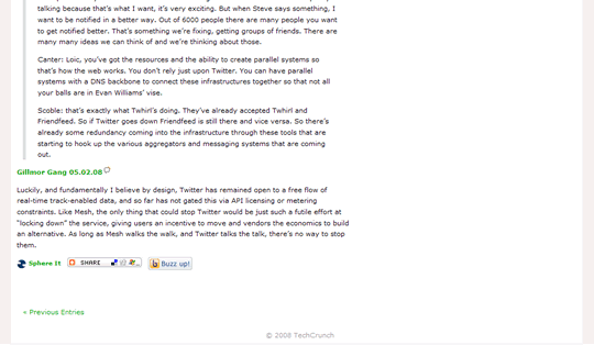
Before: What Footer?
Currently, the site footer is almost non-existent:

This seems like a lost opportunity to me as there are so many things you can do with a web site’s footer area — blogs in particular — to bring new content to readers’ attention.
With this thought in mind I took a shot at redesigning the TechCrunch footer.
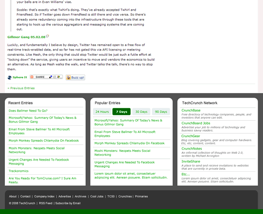
After: It’s…So…Beautiful!
Bearing in mind that this is the product of about an hour’s work and is not intended to be presented as a finished design, here’s what I came up with:

As far as the content to be included in the footer, my rationale is as follows.
TechCrunch Network
The TechCrunch network is quite a large family of sites, some of which may be less familiar to TechCrunch readers.
I thought it would be a good idea to list the sites in the network along with a brief summary of what each was about.
Popular Entries
TechCrunch is updated many times a day, and I don’t have the time or interest to read through all the posts.
However, it would be useful if I could see what posts were recently popular — much like Digg does — so that I could make sure I didn’t miss out on any major stories.
Recent Entries
This section is a pretty default option for an informational footer like this. It’s never a bad idea to make more posts available from the home page.
However, this area could be used for anything, depending on the priorities of the site — advertisers, comments, categories, you name it.
Parting Thoughts
Regardless of what you think of my footer design, the point I’m trying to make is simply to do something with this area.
This is free space to use. It doesn’t get in the way of your main content and vie for your readers’ attention. It doesn’t complicate your information architecture.
However, when done right it just might provide enough of a hook to keep your visitors reading your content rather than heading off elsewhere.