After the home page the most popular landing pages for Supercircuits (one of the online stores I run) are the category pages.
While they are well optimized for SEO, since I joined the company I’ve wanted to make them more like landing pages — jumping off points from which to explore our products.
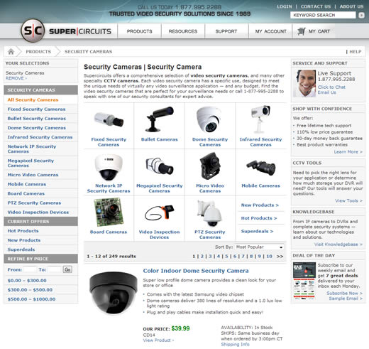
I finally had a chance to start making some moderate improvements to our security cameras page; namely adding the product sub-categories to the main body of the page instead of them solely being accessible via the left hand navigation.
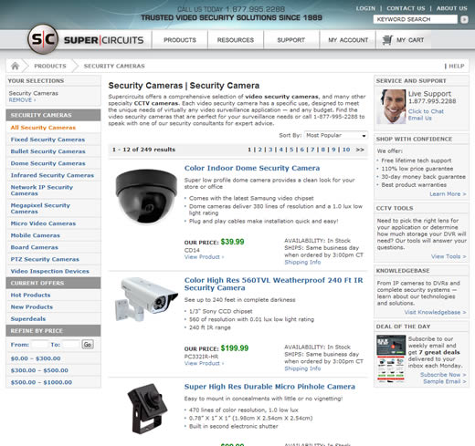
Here’s how the category page looked before:

And here’s how it looks after adding the sub-categories to the main area:

Please bear in mind that this was a quick test to see if making changes to the page would have any effect on bounce rate.
The good news is that in the month since the changes have been in effect, the bounce rate has gone down from around 35% to 28% — a 20% reduction. Here’s how it looks in Google Analytics:

Of course, it doesn’t take a genius to point out that the original page design was not very appealing to visitors and didn’t help with orienting new visitors to the page.
However, it’s interesting to note that just pulling out the product sub-categories from the left hand navigation and into the main area of the page significantly reduced bounce rate.
Next steps are to improve the design and add more landing page-like features such as product offers, featured items, etc.
That will probably have to wait, though, as we’re moving to a new e-commerce platform and new site design (can’t wait!).
Nice article, was looking for such a article since long. Thanks.
Hi Christian,
It’s really nice to see that an addition of a design element (the Product Sub Categories with their sample images) actually paid off quite well.
A 20% reduction in bounce rate is really great 🙂
Congratulations! 🙂
Have you done the overlay option within Google Analytics to see if people were previously spending time trying to click through the many pages? Something we did on our site: http://www.elevatedthird.com/work was create the thumbnail teaser image.
Maybe the categories don’t need to be listed if there are images representing them in the center of the page.
Personally I would use the space to promote specials, put a nice request a quote or item box or something.
That’s just my two cents, great post though.
That’s a great example of landing page improvement! I wonder how it has impacted upon conversion, have you recognised an increase yet? Nice work 🙂
Really interesting that you have reduced your bounce rate like that!! I have been running http://www.EasyCaribbeanShop.com is about 48% which I think is a bit high…any advice??
Thanks
Ian
Thanks for the advice !
Wonderful post! Thanks for the great share
Nice post but would like to add that interlinking of posts decreases bounce rate to very much extent. You can also try to get related links
thanks’ i will try it on my site, though i’ve allready did it, now i’ll have some more motivation to do it.