In researching sites to include in my post on good typographic style I came across countless examples of poor typography and layout. One of those was GQ magazine, which surprised me given the quality of the magazine’s print version.
Take a look at a sample article and judge for yourself.
I thought it would be interesting to see what improvements could be made to the typography and layout of the article.
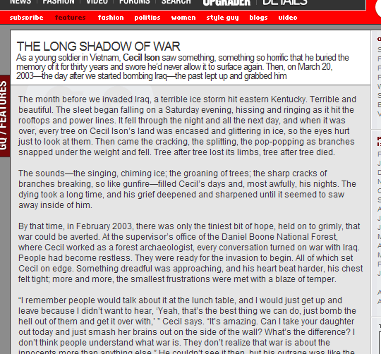
Here’s the page before:
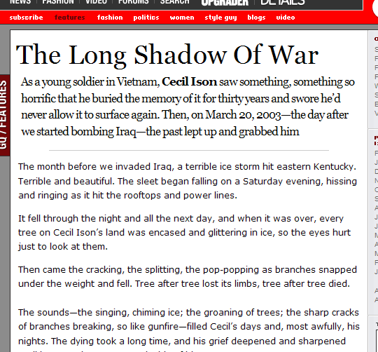
And here’s the page after 15-20 minutes of tweaking:
Did I make my point?