Usability guru Steve Krug’s Don’t Make Me Think: A Common Sense Approach to Web Usability (now in its 2nd edition) is one of the best books on web usability that I’ve read. Why? Because it’s short, easy to read and covers all the essentials really well.
This is the one book I would recommend to anyone who has something to do with web sites, whether it’s building them, writing for them or running them.
Krug tackles this important and often overlooked subject with a humorous style (some of the footnotes actually had me laughing) and uses great examples to get his point across.
You can get an idea of his sense of humor from his company’s motto:
It’s not rocket surgery
The main premise of the book is that the most important thing you can do to make sure your web site is easy for people to use is not to make them think.
Krug then proceeds to cover the main topics involved in achieving this goal. These are:
- How people want to use the web (hint: “don’t make me think)
- How they do use the web (they scan, satisfice and muddle through).
- How to design web pages for scanning rather than reading
- Why users prefer mindless (obvious) choices
- How to write for the web
- How to design navigation
- How to design your home page
- Why web designer arguments about usability are a waste of time (hint: you need to ask your users)
- How to do simple usability testing (cheaply and easily)
- How to interpret usability testing results
That he covers all this content in 224 pages (you can read this book in a couple of sittings), in such an interesting and readable style is in itself an achievement.
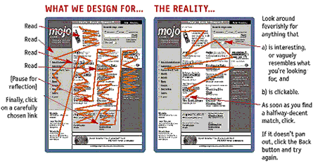
Krug also litters his book with screenshots, ‘before and after’ examples and cartoons to make his points.
Here’s a sample:

The thing I particularly liked about this book is how practical it is. There are many recommendations that just make sense and are quick and easy to implement.
Once you’ve read Don’t Make Me Think, you don’t have to embark on a full-scale redesign to realise seom value from it (although you might want to).
Implement some of the smaller recommendations (e.g. omitting needless words, make links and buttons obviously clickable), and develop a culture of usability within your organization by following Krug’s usability testing advice. Your site will be heads and shoulders above the majority of others out there.
In Addition
Krug’s web site provides a couple of resources to kick-start your usability testing:
- Sample usability test script (PDF)
- Video consent form (Word doc)
Thanks, I think I’ll get this book today. Usability is so important but I think it gets overlooked sometimes.
Debbi
Cimmeron Studios
Affordable Web Design
Debbi – good idea! Also, if you’re not convinced, chapter 11 is now available to read online (see link above).