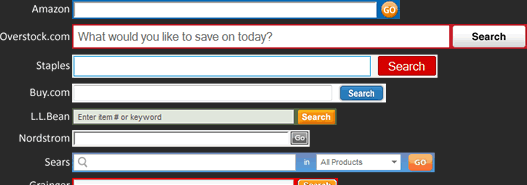
Search is an important component of any large website, especially an online retailer with thousands of products.
However, when visiting different sites I’ve seen little consensus on how many characters should be viewable in a search box, even though being able to read what you’ve typed is key to search usability.
I thought it would be interesting to review the search boxes of web retailers to see if there were any best practices that could be learned from them regarding search box size.
Rather than pick sites at random, I took my list of online stores from Internet Retailer’s top 500 list and picked out the top 30. After all, for these sites search should be an even more critical component as it would be used so frequently.
To determine the size of each search box I repeated the string “1234567890” and stopped adding numbers when the initial “1” was no longer visible.
Results
The average search box length was 29 characters and the median was 27 characters. Interestingly, this closely matches Jacob Nielsen’s recommendation (albeit made back in 2002) that search should be at least 27 characters wide.
50-59 Characters
4 out of the 30 stores (13%) chose to emphasize search with really big search boxes. Not surprisingly, Amazon led the way (as a point of reference, Google’s search box fits 49 characters).
- Amazon – 59 characters
- Overstock.com – 56
- Staples – 50
- Buy.com – 50
40-49 Characters
Another 4 stores (13%) had large search boxes, although the size of the box relative to the rest of the website was greatly influenced by the padding and font size of the search text box.
30-39 Characters
Only 2 stores (7%) chose the ‘middle’ ground of the 30 character range.
20-29 Characters
A full 40% of stores – 12 out of 30 – had search box lengths in the 20s, with quite a lot of clustering around the average search box size of 29 characters.
- NewEgg – 29
- Williams-Sonoma – 29
- Office Depot – 28
- HSN – 28
- Dell – 27
- Walmart – 27
- CDW – 27
- JCPenney – 24
- Best Buy – 23
- Sony – 21
- HP – 21
- Avon – 20
10-19 Characters
Over a quarter of stores – 8 (27%) – had very small search boxes. This was surprising given how screen real estate has increased over the years. I don’t really see why these search boxes need to be so small.
Here’s how the search boxes compare when placed side-to-side. Click on the image to view the full version.
A follow-on study I would love to see is whether smaller search boxes cause users to enter shorter, less descriptive search terms and hence reduce search usability.
It would be interesting to test if increasing search box size had a direct correlation with longer search terms and better search results.
