I recently cancelled my account with online backup service Mozy as they have discontinued their unlimited storage plan. Before I did, however, I moved to another service which still provides this option.
In order to find a new provider, I started my research on Google and it quickly became apparent that there were several online backup services that provide unlimited backup for about $5 per month.
They all offer approximately the same features as far as my needs are concerned, for about the same price.
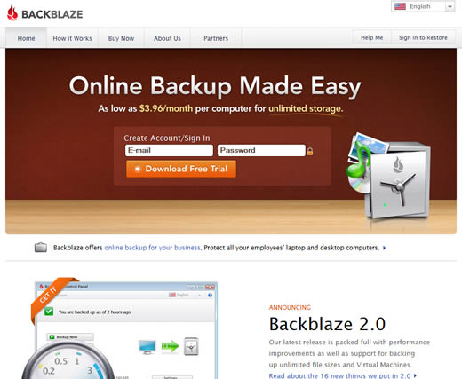
In order to decide between them, the basis for my decision moved to which backup service did I like the look of the most. I wasn’t about to download a trial of each service, so my decision was largely based on reviewing the website of each company.
I figured that the one with the best designed website would also have the best UI for their backup program. In short, I was looking at the websites to see which one gave me a ‘good feel.’
Based on this approach, I ended up choosing BackBlaze. If I am going to be using a program and/or online service it’s important to me that the UI makes it easy and enjoyable to use, and theirs seemed most closely aligned with the design aesthetic that appeals most to me.

Not only that, but a well-designed website makes me feel that if the company cares about my experience when I’m just visiting and learning about their service (‘kicking the tires’ if you will), they will also care about my experience when I am a customer and am actually using their service.

And when you are competing in a space where the services offered are largely commoditized, other than price, it’s this focus on user experience that sets a company apart from its competitors.
In a similar vein, I joined Spotify a few months ago. I was looking for an online music service and all the hype convinced me to give it a try first. However, other than the huge selection on music, I haven’t been that impressed by Spotify.
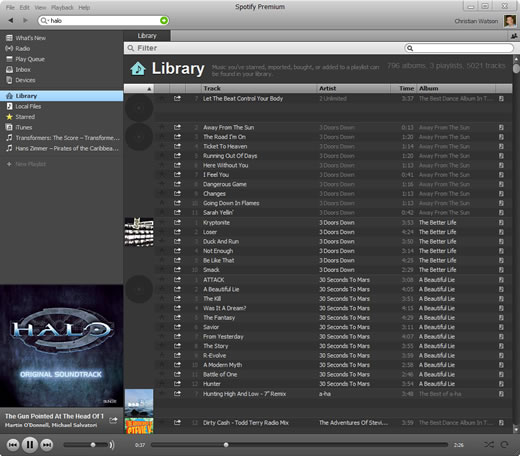
Again, it comes down to user experience. The fact that it requires a desktop program that looks like an iTunes clone feels antiquated when most other services I use are web-based.
The iPhone app is clunky and unintuitive to use — all of which combines to produce a less-than-stellar user experience.
Since then, Spotify’s competitors, Rdio and MOG, have started offering a free option, so I have been able to check both of them out too.
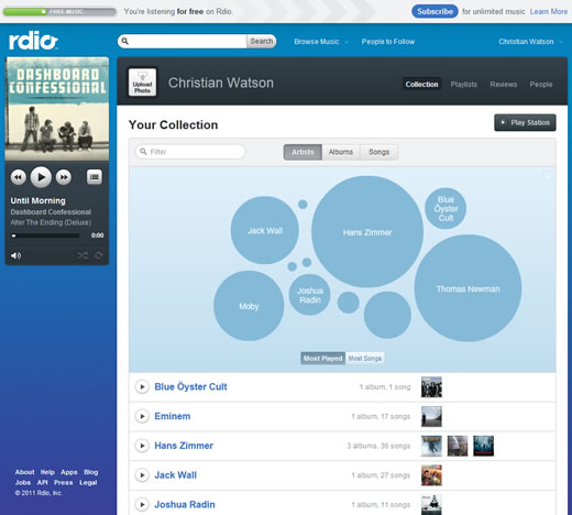
The experience of using Rdio’s web interface is almost night-and-day compared with Spotify. The elegant UI is both a pleasure to look at and use, and it makes music discovery so much easier than Spotify (an important feature when you have a library of millions of tracks to explore).
Here’s how you manage your music library in Spotify (hint: lots of scrolling — way worse than iTunes):

Here’s how you do the same in Rdio:

Even though Spotify has the larger music library, when I am listening at my computer I prefer to use Rdio because the user experience is so much better. I’m sure it’s only a matter of time before I switch.
What other services have you chosen based on their user experience — either on their website or in the application itself? Let me know in the comments.
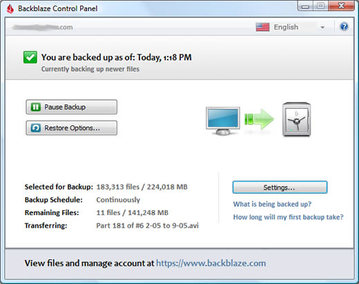
I made the same switch, from Mozy to Backblaze. Backblaze is a much simpler hassle-free back-up service.