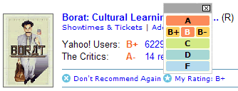
I was browsing around Yahoo! Movies the other day, which as Borat would say is very “nice”. However, I was struck by an interesting interface design decision they had made.
When you try to rate a movie you’ve seen a small widget pops up which gives you the option to rate the movie from A+ to F.
Sidenote: I love the number of choices. Far better than the usual 1 to 5, which means that most movies end up as a 3.

What’s interesting is that the scoring for each grade (e.g. B-, B, B+) goes from right to left instead of left to right.
Seeing as most of the site’s visitors read and write from left to right, I wonder why the design team chose to have the top score on the left.
This was completely counter-intuitive to me, and as I was going through movies rating them, took a while to get used to. Not a big deal, but strange nonetheless as it seems so obvious to do it the other way round.
I can understand what you are saying but to me that seems the logical way round – reading from the top I read A, B+, B, B- etc.
What struck me was: “Why no E?”
See, http://developer.yahoo.com/ypatterns/pattern.php?pattern=hoverinvitation#
They probably just screwed it up. (Borat was definitely an A)
*Andrew* – I agree that vertically it reads correctly. However, I don’t think it reads correctly within each horizontal band.
I see you’re a Brit. As a Brit living in the US, I believe that there is no ‘E’ score when it comes to grading, for some reason.
*Boris* – thanks for the link, but it doesn’t explain the rationale for putting the order from right to left.
*Jake* – Well, I’d say B+.
In any case, the Yahoo! designers are really bright folks. That’s what makes it interesting — it was clearly a design decision that I don’t understand and I’d love to know the thinking that went into it.
Hey Christian, I tried sending email via your contact form just now but it says your webhost has disabled the formmail script so it is no longer operational. Thought you would like to know.
Sorry, but to me it makes perfect sense the way it is. I’m an Australian FWIW – perhaps it’s an English thing?
For me, this makes sense as a way of displaying rows of numbers in a right-to-left system:
1 2 3
4 5 6
7 8 9
The Yahoo widget makes sense to me in the same way:
A+ A A-
B+ B B-
C+ C C-
That said, the system I’m noting really only makes sense when you can see the whole thing at once, and realize that the top-left corner is the highest ranking. When each “row” collapses into a single letter, I can certainly see how the row-by-row expectations might be reversed.
The takeaway, I suppose, is that context matters.
*Jim* – ack! Thanks for the heads up. I’ll get it fixed.
*Mike* – I’m afraid I don’t follow you at all. In your example, 1 is the best rating and 9 is the worse — isn’t it usually the other way around?
What seals it for me is that star rating widgets (e.g. IMDB, Netflix) go from left to right; with 1 (on the left) being the worst score and 5 (on the right) being the highest.
So does Yahoo! choose not to follow this convention?
I understand where you are coming from as we are used to seeing the worst rating on the left (1->5) but if the same pattern was followed for the rankings I dont think it would make much sense.
When you see a list of available grades its always in alphabetical order from best to worst. A+ A A- B+ and so on.
This is simply following these same rules and allow breaking the convention established for numeric rating systems it is following the conventions for alpha ratings. (IMHO)
*Aaron* – sounds like I am in the minority here!
This just goes to remind me of the maxim _”Never design for yourself.”_
Of course, in the real world I would have tested this out with users before implementing any changes. 😉