
Grab is a mobile app, like Uber or Lyft, which you use to book a car or taxi to drive you somewhere. I use the Grab Android app everyday to take my kids to and from school. Overall, it has a good user experience, especially after a recent redesign. However, there are still a number of usability ‘niggles’ which I suggest how to solve below.
1. Save the most recent note to driver
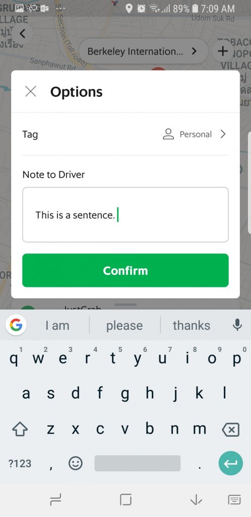
Every time I open the Options dialog to add a note to the driver I see this default view:
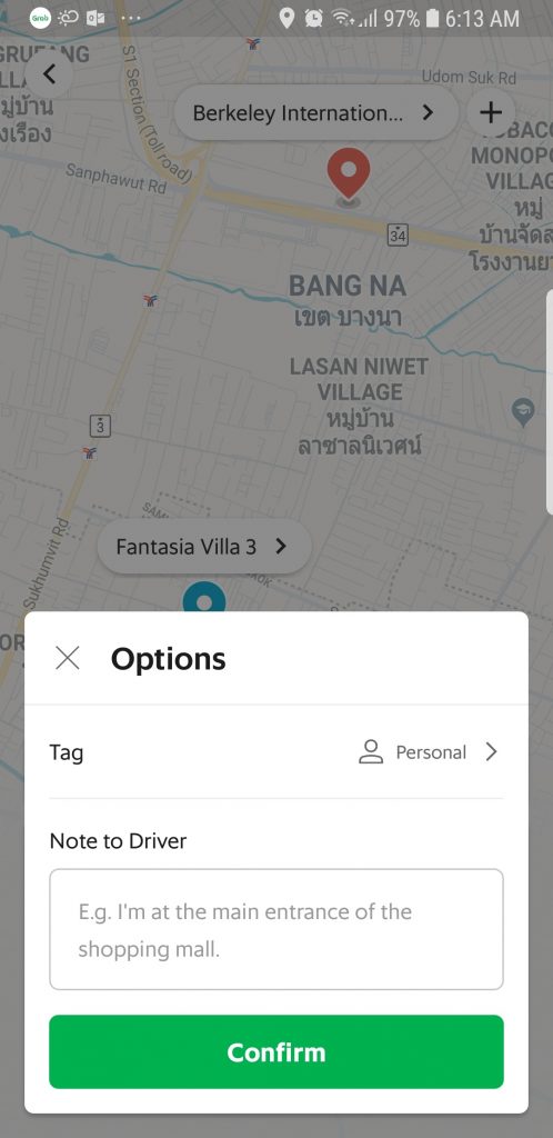
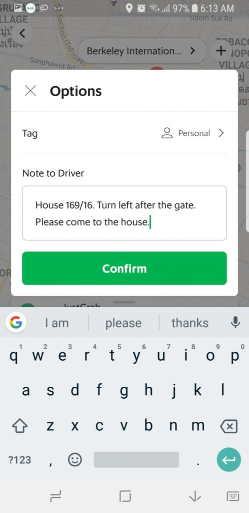
This means that I have to enter the same message about where to go every time I use the app to arrange our school pickup:
It would be so much easier if the app saved my most recent note to the driver so that it is ready for me to re-use. The text field would also need to include a “Clear All” button to remove the text in case I wanted to enter a new message.
2. Double-tap to zoom the map
The Grab app only supports zooming into the map via unpinching. This means that to zoom in on a location — for example, to see where your taxi is in more detail — you need to use the app with two hands.
It would be very useful to support double-tapping on the map with my thumb to zoom in (like Google Maps) so that I can use the app one-handed.
3. Make it easier to enter a promo code
Tapping on the promo code icon in the Options dialog display a screen that displays looks like this:
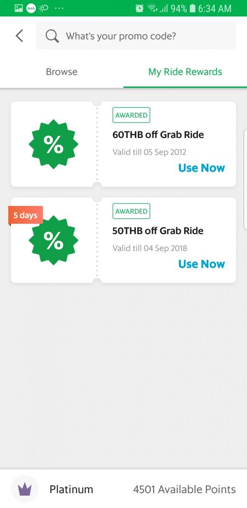
As a heavy user of the app, I’m lucky enough to have a couple of rewards saved up and ready to use, but for most users the main action on this screen is to tap into the text field to enter a promo code.
As phone screen sizes increase, this is becoming harder to do with one hand. I have large hands, and on my Samsung Galaxy S8 I really have to stretch to tap into the field with my thumb. I see a couple of options here.
The simplest would be to automatically place the cursor in the promo field when the screen displays and open the keyboard so you can just start typing the code.
The other option would be to redesign the screen so that the promo input field is closer to the bottom of the screen, making it easier to reach with your thumb.
4. Save your booking state if you leave the book-a-ride screen
Surprisingly, the Grab app does not save in-progress bookings if you leave the screen. Tapping on the back button takes you to the default home screen with everything reset 😞.
Let’s say you’ve started to book a ride and have searched for your destination and entered a note to the driver. However, you forgot to check the Notifications screen for a promo code.
In order to check, you need to tap back to the Home screen first which resets everything you have entered! It’s very annoying, and trips me up on a fairly regular basis.
It would be far more user-friendly to save the state of the in-progress booking so that the user can easily continue from where they left off.
5. Use the right keyboard type throughout the app
Admittedly, this is a small one but when I’m typing a note to the driver, the keyboard is not set to sentence case so that the first word of each sentence is automatically capitalized.
It’s a small issue, but an easy one to fix by changing the keyboard type. It’s little touches like these that designers can use to show they really care about every part of the user experience.
6. Don’t block key user tasks with notifications
The Grab app has an annoying tendency to display in-app notifications when you least need them. For example, when I’m in the middle of making a booking I don’t want to see a notification for something that is not currently relevant to me.
I prefer to see in-app notifications limited to screens where I am not performing a key task like booking a ride. Save them for the home screen or when I’m browsing the rewards area, for example.
7. Keep UI elements within easy thumb reach
Another small improvement, but the Grab app should keep UI elements like close buttons within easy thumb reach wherever possible. For example, the close button in the Options dialog is on the left:
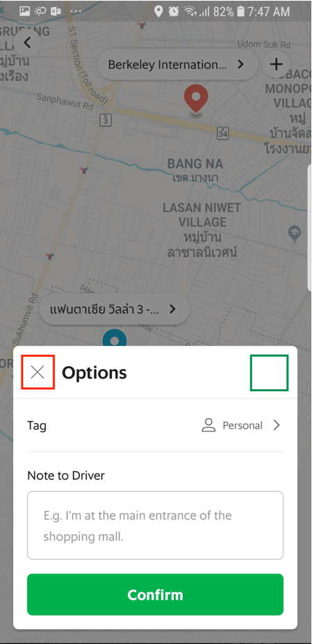
While it’s reachable by my thumb with a little stretching, if it was moved to the top-right of the dialog it would always be within easy reach.
8. List menu options in the navigation drawer based on usage
Based on my own experience, I’m going to guess that Notifications and GrabRewards are the two most-used options in the navigation drawer, with Notifications being number one.
Yet despite this, the Notifications menu option is positioned more than halfway down the screen:
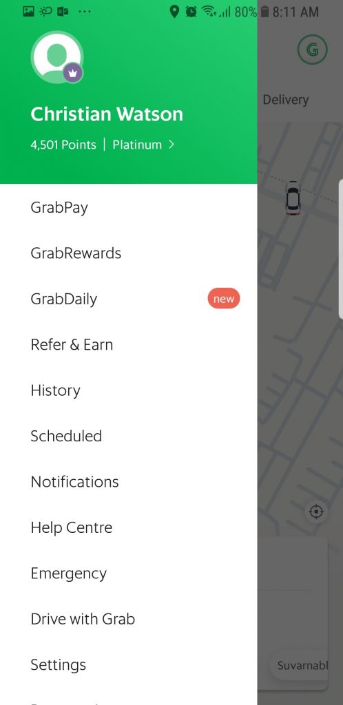
I’m not sure what logic has gone into the ordering of the menu items, but listing them based on usage would be a good place to start.
Grab seems to be updating their Android app on a regular basis, so let’s check back in in a few months and see which of my complaints still exists!
Nice article, I loved your points as per developer I would like to say, Managing a better user experience is critical to almost every business. After all, it is part of the way that a customer engages with your company and/or your brand. It’s important to get it right so that the customer has a positive experience. Without a good experience, you can lose customers and that can hurt your bottom line in the long run.
A good UX is what separates successful apps from unsuccessful ones. Today, mobile users expect a lot from an app: fast loading time, ease of use and delight during interaction. If you want your app to be successful, you have to consider UX to be not just a minor aspect of design, but an essential component of product strategy.