Footer design has come a long way in the last few years, as can be seen in the many footer design showcases on various web design-related blogs. Creativity and aesthetics aside, what are the elements that make up a great footer design?
Site Map
Many web site footers contain some level of site map. Often this is a duplication or expansion of the main navigation in order to aid the visitor as they move around the site.


With more options for where visitors may want to go, e-commerce sites can have a much more detailed site map.

Site Map Link
It’s probably a good idea for a site of any significant size to have a site map. And if you do have a site map, your users will expect to find a link to it in the footer.

Legal Links and Copyright Information
Despite the expanded use of the footer, it’s still regarded as the place to go for copyright information and legal-related links such as your privacy policy and terms of use.


Contact Information
It makes sense for commercial websites to have their contact information easily available. Where better than in the footer?
In addition, for businesses with a physical location, a link to a map and driving directions can be a great help for visitors.
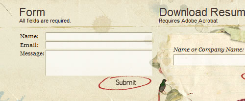
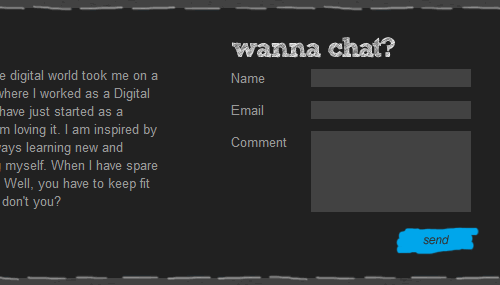
Contact Form
Some sites have taken it a step further than simply providing contact information by including a contact form in the footer as well.
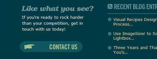
If space is tight, a call-to-action button makes a good alternative to encourage prospective customers to get in touch.

Newsletter Signup Form
Many online stores provide a convenient email signup form in the footer. Signing up for (yet) another email is often an impulse action for customers, so it’s sensible to make this as easy as possible.


Search Form
If a site design does not allow for a search form in the header or if search is an action of secondary importance, the footer provides a viable alternative location. It’s unlikely, however, that visitors will know to look for search in the footer without discovering it first through browsing.


Social Media Buttons
The footer makes a great place to place your social media links in an easily accessible place on every page.


Recent News / Twitter Feed
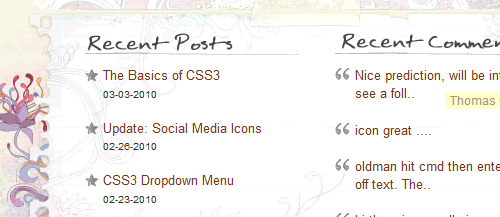
By breaking a footer up into columns, it’s easy to include lists of recent news, blog posts, tweets, etc. These can give visitors a quick insight into what is going on with your organization and encourage them to venture further into your site.

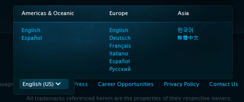
Region / Language Selector
It’s common to place country/language selectors in a ‘utility’ navigation in the header. However, if a site design does not support such a layout then the footer is a good alternative location.

Methods of Payment Accepted
It’s a good idea for online stores to let customers know upfront what methods of payment are accepted. Putting this information in the footer makes it readily available to visitors.
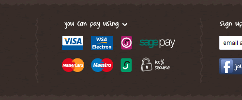
The footer is a good location for other e-commerce related information, such as security badges, guarantees and offers, as well as customer support information.
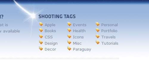
Archives / Categories / Tag Cloud
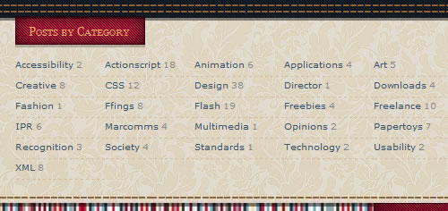
The footer makes a good place for blogs to list post archives or categories. Tag clouds seem to be less popular these days, but can fit within the navigational context of the footer well.
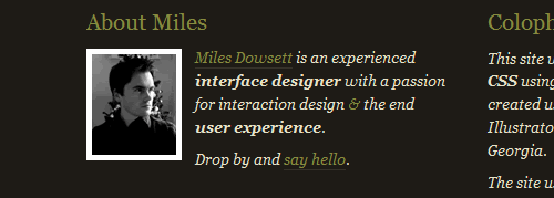
Company / Personal Overview
Since almost any page on a website can be the first one that a visitor encounters, a quick summary of the company or person can help orient new visitors. This overview can also help to add a little personality to pages that would otherwise be dry and factual.

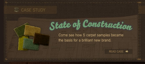
Featured Content or Work
Footers make a great location to showcase your best content or work so that you can do your best to ensure that visitors don’t miss it, even when they reach the bottom of the page.

Awards and Accolades
Similar to displaying featured work, listing awards and accolades in the footer allows you to show off your success and expertise without being too upfront.


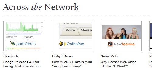
Links to Site Network
If your site is one of a number in a network, it makes sense to link out to your partner sites. The footer is an ideal place for these links.

A Personal Touch
While the footer can contain features that aid usability and drive visitor interaction, it can also be a great place to add a touch of personality and have a little fun. After all, we’re all people.
