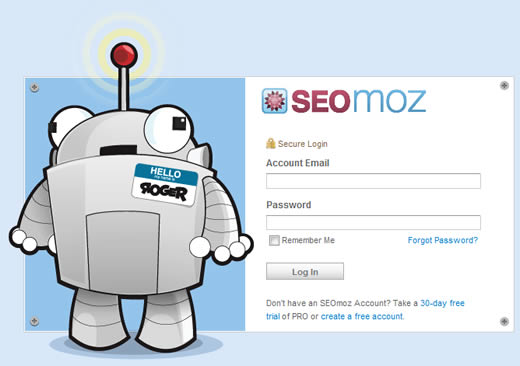
Login forms are often such sterile, unfriendly places. Which is why it’s nice to see SEOmoz taking a more people-friendly approach. Visit their login page and, along with the standard form, you will be greeted by a cartoony robot called Roger.

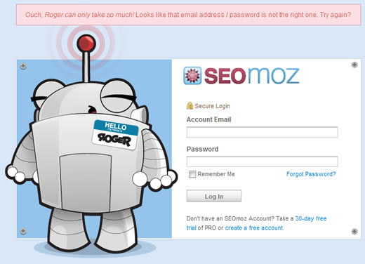
Better still, if you make an error when logging in, not only are you presented with a user-friendly error message, but the image of the robot also changes:

This reminds me a little of a post I wrote a short while ago on bringing the human touch to the signup process.
To my mind, anything you can do to alleviate the user frustration that can be encountered when filling out forms is a good thing.
It’s a very nice example to combinate both, the “machine” and the human.
It’s a cool and nice feature, but user-friendly? I don’t agree with you on that one.
The error message is way to vague and to far away from the form itself, not something I would recommend on a public website. 🙂
funny….adding a little personality can go a long long way. How many people keep getting it wrong to watch the robot change though?
i think it will be good for visitors when they will be logging in because if they do mistake during logging in so the picture will give the same message. it took less time of visitors to understand the things.
That is cool! Make you want to enter the data incorrectly just to see it work.
Nice share, Thanks
This is a cool login form. This is very much user friendly.
Wow i like it .Roger is great .Cool post, keep posting.
Hillarious! I want their website designer!
Nice Roger Robot. This will not fear your customer away if too formal and strict in sign up a form. I love the Robot and start thinking should i put a cartoon as well in my log in side. Will this will slower down the loading of the loading of the log in pages?
Haha it’s great, I love Roger & SEOMoz 🙂 very cute!
Its very good . SEOMOZ is very informative.
Thanks for this post, your contact page on your website is one of the most important pages you will design. A lot rests on this little page to collect that all important data from your customer/client. The most important factors should be functionality and the ability to collect all the necessary information you require. A good contact form should be clear, concise, simple and most of all designed well to encourage your customers input.
Hahahaha!! Good stuff! I love that robot – that nametag is sooo cute!!
Good blog!
Its a nice feature, but I think it is more important to show an error message which give a short and correct information. The error message should be displayed in a box thats look like an error message box (red font, red border, exclamation mark, …).
I love the SEO Moz Login page. It really is a great example of a very user friendly and intuitive approach. Plus the robot is very cool.
SEO Moz does invest a lot on usability and with their expert team they infact do a lot of usability consulting too. Good to see experts following what they preach.
Love the idea of making people smile at the last place people would think to have a smile on there mind. It’s a good philosophy to hold onto and to implement where ever possible.
Nice one!!!!!
Specially Roger Robot looks very cool.
brought a human touch to my day!
thats pretty cool. check out what we do. Digitaldesignzmedia.com
Now THAT is a nice login form. I realy like Roger the robot. I don’t think it wil work for any site.
As said before, the error message is too far away from the form for some sites.
Allso that if an error happens, Roger changes his radar is cool.