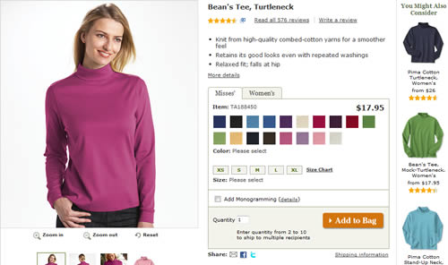
I’m in the process of redesigning an ecommerce product page which currently has the product images on the right hand side of the page. As part of the redesign I am proposing placing the image on the left. Why?
Well, many other online retailers follow this practice so it appears to be a strong design convention.
It also fits with the f-shaped reading pattern that most users employ online – which means that the most important information (in this case, the product image) should be at the top left of the page.
However, to better support this recommendation when I present it to stakeholders, it would be helpful to know of any research or articles on the subject of product image placement.
Despite the many articles on ecommerce and even product page design best practices, little appears to have been written specifically on product images and nothing about their placement on the page.
I am also interested to know how much it matters which way a product is facing. Intuitively, it feels that the product should point into the page, drawing the reader’s eye to the copy.
But is this, in fact, correct? Does it even matter? Again, any research or articles specifically on this topic would be very helpful.
Loads of online shops I use have the image on the left. Looks better in my eyes.
there’s no ‘correct way’ with design. what’s common place in ecommerce sites is only common because companies tend to be too corporate or too afraid to break from the norm, despite the fact that there may be a better way. there’s always room for improvement in communication design.
don’t be afraid to push for something you feel works.
Thanks for the feedback. I personally prefer to have the image on the left — that’s where my eye is drawn when I visit a product page.
I understand the appeal of trying something different, but in this instance because of other competing priorities I just need to make a decision that I can back up.
Thanks for providing such a good information.
Anwer
No matter if the image is placed right or left only the quality speaks .
Quality image catches the customer’s eye.
well, I think the images should be in the left. there’s where users are used to look first and they should see a nice image there
@Christian you say you prefer images on the left, because “that’s where my eye is drawn when I visit a product page”… well, yes, but in this case it’s a good idea to also make the image clickable.. i made a test with crazyegg and I noticed a lot of users clicking my images… i think they were hoping for them to enlarge:P
Image placement do play important role in web design, because there is the fist impresion on the landing page which customer look at it then only the title and the subtitle. Either you do follow the customer behavior or design it with your own personalities such as full flash website that call to action to your reader.
hm… i think it’s better in the left side, because there’s where the users look first…