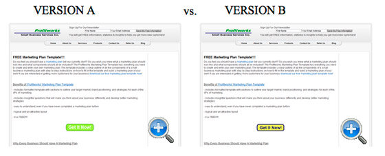
The folks at unbounce have rounded up a great collection of landing page A/B tests where the results may not be what you’d expect at first glance.
Unfortunately, you can’t view the actual A/B tests in detail without a Which Test Won paid account, but you can see enough through the screenshots in the blog post and the commentary on each test to get a good idea of what worked and why for each test.

I particularly liked test #11 where a button design change resulted in a 14% uplift in conversions. Despite the number of landing pages my team creates, I’ve yet to do such a specific test myself — sounds like it’s long overdue!
Cool stuff. Help for web designer who are creating sites for themselves.Saves the cost of going to a creative design and marketing agency for me.
I don`t follow this post correctly, what are you trying to say in this post?
Sorry for sound a little numb, I just don`t get it.
The testing results are really surprising. Mainly test 1 (Which Copy Increased Trial Sign-Ups), test 4(Does Matching Headline & Body Copy to Your Initial Ad Copy Really Matter?), test 7(Does an Email Security Seal Help or Hinder Lead Generation Form Completions?) and test 8(Does an Email Security Seal Help or Hinder Lead Generation Form Completions?). I really get good information from your post.