I recently happened to stumble across a lost page of technology how-tos on The New York Times website that dates back to 2005.
For some reason, it hadn’t got redirected or redesigned, and I thought it was interesting to see how the design of the site has changed in the eight years since then.
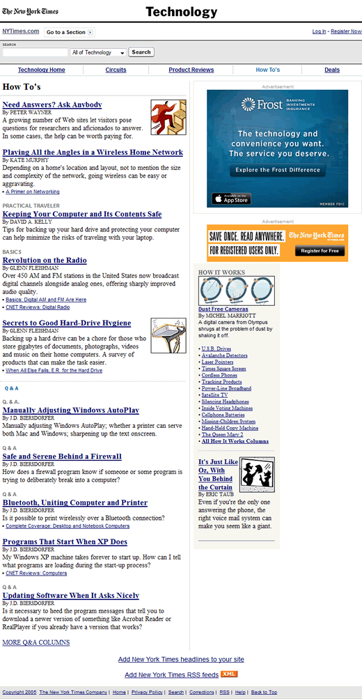
Here’s the 2005 page:

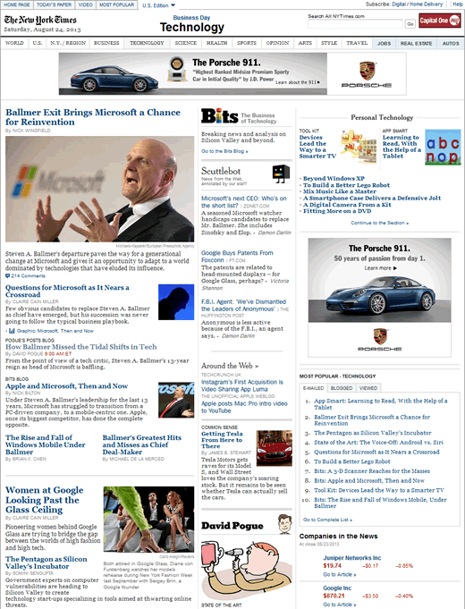
Here’s how the Technology section of the website looks in 2013 (unfortunately, the Technology How-Tos section appears to no longer exist):

It’s interesting to see how noticeably the same the design of The New York Time website still is after eight years. Other than an overall modernization of the design and widening the layout to support modern screen resolutions, there is a clear continuity of design from the 2005 version (when viewed on a desktop).
Even the font is still serif, although it has changed from Times New Roman to Georgia as the former font has largely fallen out of favor.
Although you can’t see it in the 2013 example above, the footer for both versions is still a single list of links – very different to the majority of other news sites, which tend to favor ‘fat footers’ filled with links and ways to connect.
Given the propensity for website designs to change dramatically on a fairly regular basis (even news sites), I wonder how many other long-running websites have been able to maintain their ‘heritage’ to quite the same degree?