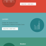
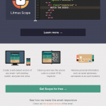
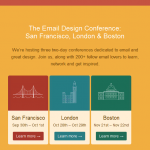
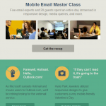
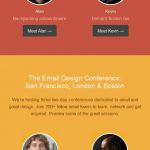
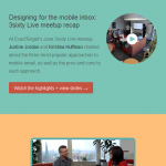
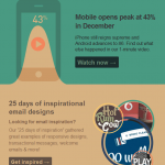
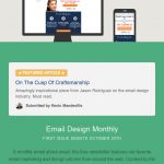
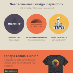
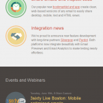
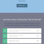
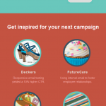
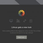
Email testing service Litmus delivers one of my favorite email newsletters. Not only do they provide great content (if you are an email marketer) each month, but from a design perspective their elegant, colorful emails are a treat to read, regardless of whether you are using a traditional PC/laptop or mobile device.

The use of bold blocks of color to separate each section within an email makes it easy to scan, with a good balance between images, graphics and text to keep the content readable and engaging.
And, with several emails clocking in at over 5,000px in length, Litmus are clearly not afraid to make their emails as long as is necessary to fit the content.
Within the showcase you will also find some excellent examples of how to create a series of emails to promote a conference (in this case, series of conferences) or event.





Beautiful example! Thanks for sharing!
I think a good balance between images, graphics and text to keep the content readable and engaging. And, with several emails clocking in at over 5,000px in length, Litmus are clearly not afraid to make their email. I like to use Android Mobile. I would like to say Thansk