Old Navy is known for its retro, kitschy designs and bold use of color in both its stores and its advertising. Their emails follow a similar philosophy, livening up your inbox with a kaleidoscope of colors, patterns and typographic styles. Read More
Showcases
Web Tooltip Design Showcase
Tooltips are a useful way to present additional, context-sensitive information about an element on a web page, such as a hyperlink.
As tooltips continue to become more common as a means for users to interact with web page elements, the need for good tooltip design has become more important. Read More

Email Header Design Showcase
I was recently working on some updates to one of our email newsletter templates, in particular the header area. I thought it would be useful to create a showcase of email header designs for reference. I certainly found it helpful — I hope you do too!
Read MoreFaceted Navigation Design Showcase
I’ve been working on improving the faceted navigation interface for one of the websites I manage. Much has been written about faceted navigation (also known as faceted search, faceted browsing, or guided navigation) as a design pattern, which I won’t repeat here. Read More

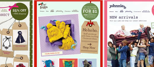
Boden Email Design Showcase
I quickly became a fan of Boden’s emails thanks to their colorful, textured designs. Whether it’s the main brand, Boden, or the two sub-brands, mini Boden and Johnnie b, the emails are always fun and interesting with many delightful design elements.
Read More50+ Examples of Highly Optimized Landing Page Design
Landing pages are a critical component of many online marketing activities, such as pay per click, email, and affiliate marketing. Much has been written about how best to design landing pages; just do a search for “landing page best practices” to see what I mean. Read More

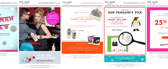
Kate Spade Email Design Showcase
Now that I am responsible for my company’s email marketing campaigns I have become much more interested in email design and best practices.
Read MoreGallery Page Design Showcase: 60 Examples of Excellent Product Category Pages
Although they are an important component of many websites and almost all online stores, very little appears to have been written about designing great category (also known as ‘gallery’) pages.
This is despite the fact the Jared Spool calls them the hardest working pages on your site given the key role they play in directing users to the correct end content. Read More
40 Bold Examples of Sale Email Design
When you’re an online retailer and you have a store-wide sale, the best way to announce it is often simply to say so – no example product pictures; just bold, emphatic type matched with a colorful background to make your message stand out. Oh, and a big discount.
Read More
Welcome Email Design Showcase
First impressions are hugely important; no less so than when a visitor to your website decides to deepen their relationship with your business by joining your mailing list. How you welcome them is a key first step in establishing that relationship. Read More