Sometimes when I’m struggling to complete a task on a website (or am watching my wife throw her arms up in frustration), I ask myself “What genius decided to build it like that?” Read More
UX Design
Reduce Bounce Rate by Making a Landing Page More Like a Landing Page
After the home page the most popular landing pages for Supercircuits (one of the online stores I run) are the category pages.
Read MoreIBM’s Smarter Planet Icons are More Cute than Useful
I came across these interesting icons on IBM’s site today, which are all part of creating a smarter planet, whatever that means. I’m trying to decide what I think of them.
While they are quirky and interesting to look at, most of them don’t convey any sort of meaning, which I believe is an important component of a good icon.
How to Make Login Forms More User-Friendly
Login forms are often such sterile, unfriendly places. Which is why it’s nice to see SEOmoz taking a more people-friendly approach. Visit their login page and, along with the standard form, you will be greeted by a cartoony robot called Roger. Read More
Mega-Menus Can Reduce as well as Enhance Usability
With the ever increasing use of ‘mega-menus’ it’s useful to see an article like the recent one from Jacob Nielsen reminding us that there are still design pitfalls to be overcome in implementing them effectively. Read More
Good Example of Marketing Email and Landing Page
I liked this combination of offer email and landing page for Google Adwords. Although the design for both is straightforward (as you’d expect from Google), both are well structured with clear layouts, good copywriting and clear calls-to-action.
Read MoreBringing the Human Touch to the Signup Process
I thought these error messages on the Formspring sign-up form were a nice touch. They add a human element to a process that often feels so impersonal, particularly if the user makes a mistake.
Read More
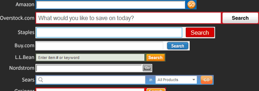
What’s the Best Search Box Size?
Search is an important component of any large website, especially an online retailer with thousands of products.
However, when visiting different sites I’ve seen little consensus on how many characters should be viewable in a search box, even though being able to read what you’ve typed is key to search usability.
I thought it would be interesting to review the search boxes of web retailers to see if there were any best practices that could be learned from them regarding search box size.
Rather than pick sites at random, I took my list of online stores from Internet Retailer’s top 500 list and picked out the top 30. After all, for these sites search should be an even more critical component as it would be used so frequently.
